1. The Soothing Appeal of Light Gray Interiors
Light gray paint colors have become increasingly popular for their ability to create interiors that exude a sense of sophistication and timelessness. These versatile shades offer a perfect balance of cool and warm tones, making them ideal for any room in your home. Unlike stark whites or bold colors, light grays provide a calming backdrop that complements various design styles, from contemporary minimalism to traditional elegance. They work beautifully with natural light, enhancing the brightness of spaces while maintaining depth and character. Whether you’re updating a single room or planning a whole-house color scheme, light gray paint colors offer endless possibilities for creating harmonious, stylish environments that reflect your personal taste while maintaining broad appeal for years to come.

As an Amazon Associate I earn from qualifying purchases.
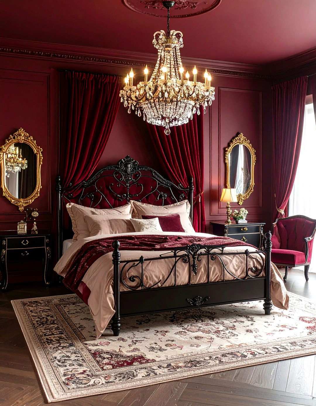
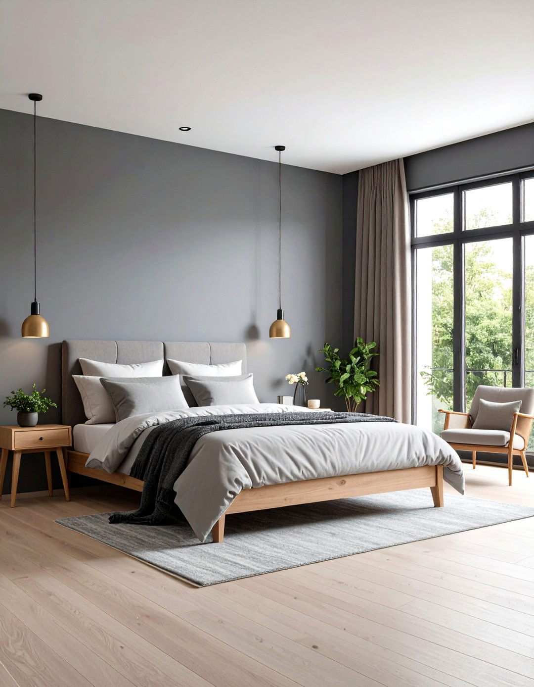
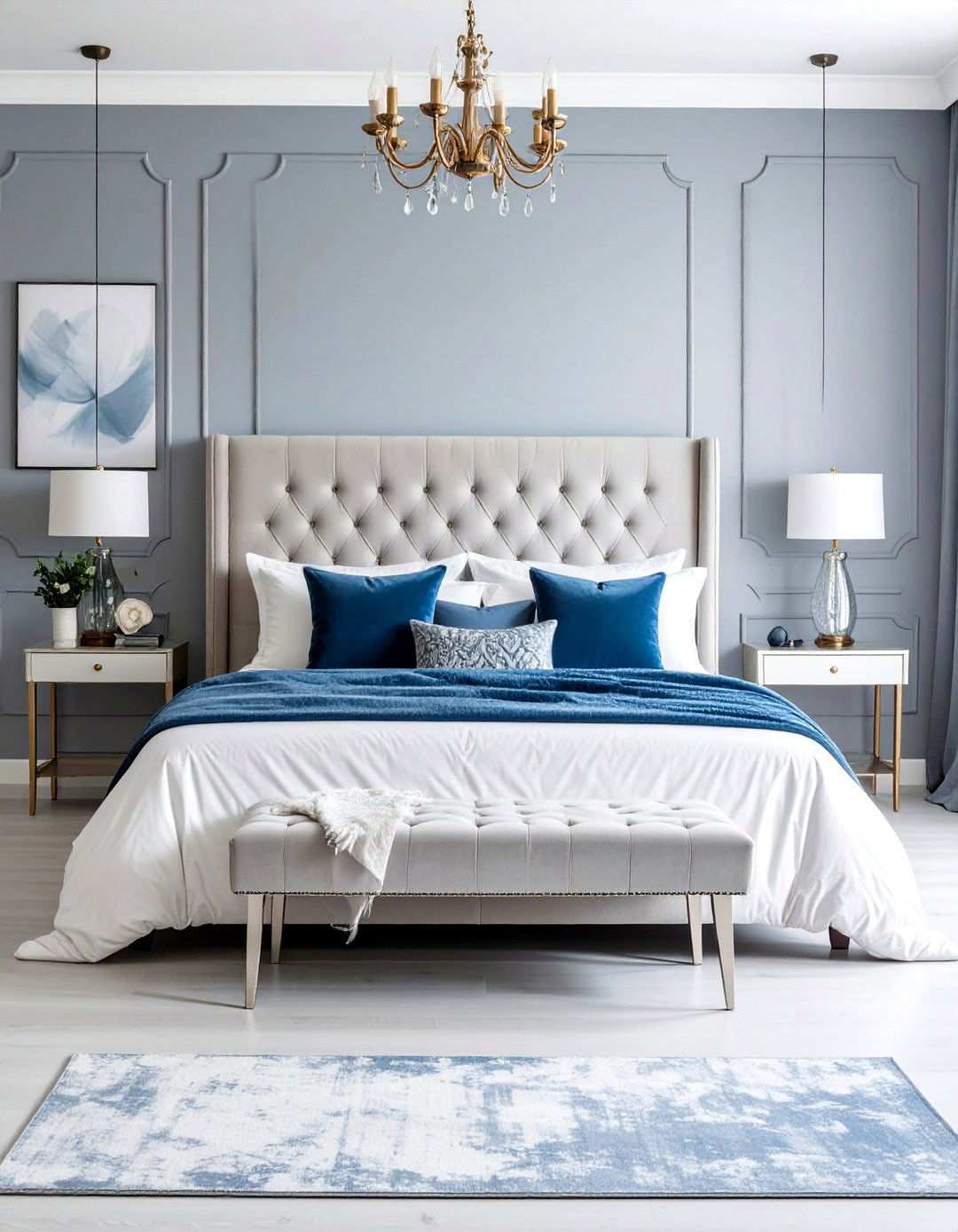
2. Agreeable Gray: The Ultimate Bedroom Retreat
Agreeable Gray creates the perfect bedroom sanctuary with its warm undertones that lean toward greige territory. This versatile shade works beautifully in master bedrooms, providing a neutral canvas that enhances both natural and artificial lighting. The slightly brown undertones prevent the space from feeling cold, while maintaining enough gray to feel contemporary. Pair this color with crisp white trim and soft textiles in cream or beige for a cohesive look. One of the key benefits of Agreeable Gray is its ability to adapt throughout the day, making it an ideal choice for restful spaces that transition seamlessly from morning light to evening ambiance.
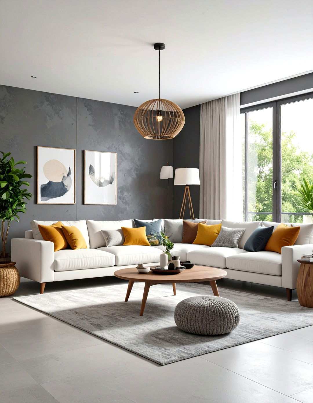
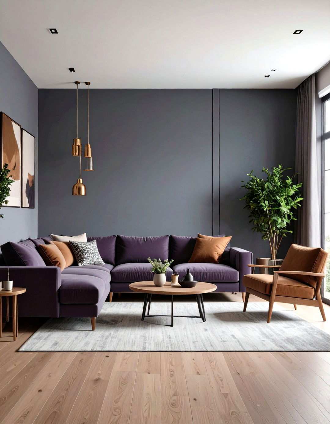
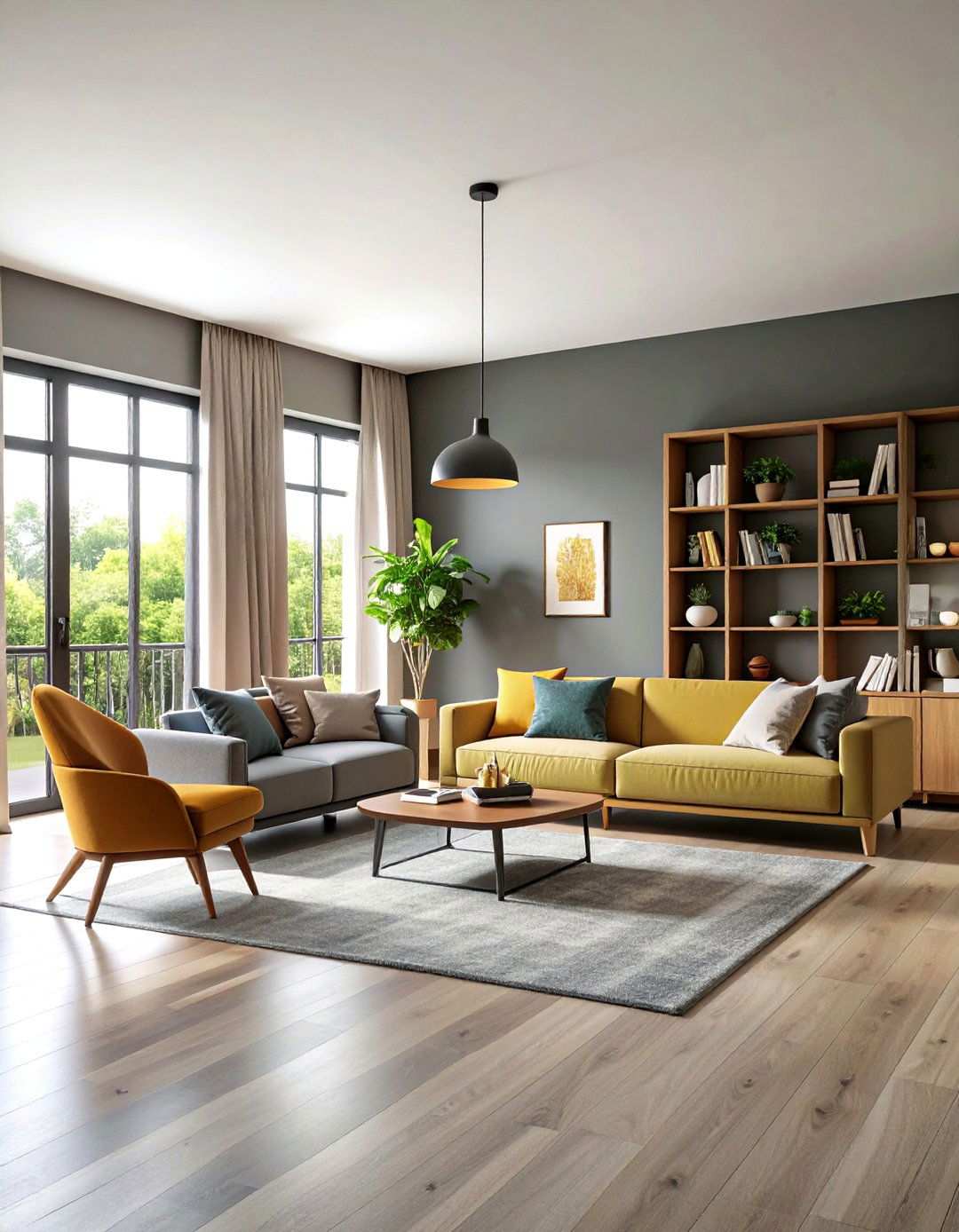
3. Repose Gray: Elevating Your Living Room Design
Transform your living room into a welcoming gathering space with Repose Gray’s warm, stony undertones. This popular shade brings depth without overwhelming smaller spaces, making it perfect for both open-concept areas and cozy family rooms. The subtle brown and purple hints create visual interest while maintaining neutrality. To maximize the sophisticated appeal of Repose Gray, consider pairing it with white or cream furniture, adding pops of color through artwork and accessories. The versatility of this shade allows for both modern and traditional furnishing styles, creating a timeless foundation for your living space.
4. Elevating Elegance with Revere Pewter
Revere Pewter is a masterful blend of gray and beige undertones, making it an ideal choice for creating an inviting dining atmosphere. By striking a perfect balance between these two hues, this sophisticated shade adds warmth to formal dining spaces while maintaining the refined elegance expected in entertaining areas. The deeper pigmentation compared to lighter grays provides an excellent contrast against white trim and crown molding. How does this color enhance your dining experience? Revere Pewter creates an intimate, cozy feeling that fosters meaningful conversations over meals. The subtle yellow-green undertones complement both candlelight and pendant lighting, making every dinner feel special. This timeless choice works beautifully with both traditional and contemporary dining furniture, elevating the overall aesthetic of your dining space.
5. The Allure of Drift of Mist
For a contemporary gray that feels fresh and current, look no further than Drift of Mist. This color boasts cool undertones that lean slightly toward blue-green, making it perfect for modern minimalist interiors. Drift of Mist works exceptionally well in open-concept homes where consistent color flow is essential, creating a sense of cohesion throughout the space. The lighter depth makes spaces feel larger while providing enough substance to create visual interest. What makes this color particularly appealing for modern design? The subtle coolness pairs beautifully with concrete, steel, and glass elements commonly found in contemporary architecture, creating a seamless visual connection. Drift of Mist creates a serene backdrop that allows modern furnishings and artwork to take center stage, making your space feel both sophisticated and calming.
6. Finding Serenity in Light French Gray
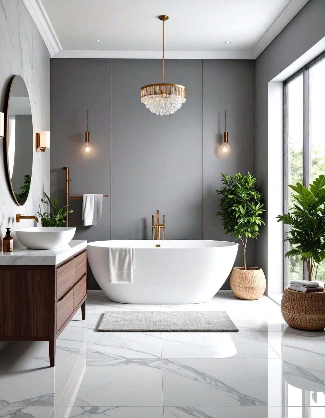
Transform your bathroom into a spa-like retreat with Light French Gray’s gentle, soothing presence. This delicate shade creates an airy feel in smaller bathrooms while providing enough depth to feel substantial in larger powder rooms. The subtle warmth prevents the space from feeling sterile, while the light tone reflects available light beautifully, making your bathroom feel brighter and more spacious. Can a single paint color make your morning routine more pleasant? Light French Gray creates a calming environment that helps start each day peacefully, setting a serene tone for the day ahead. Pair this elegant shade with white fixtures, marble countertops, and soft towels for a luxurious hotel-inspired bathroom design that exudes relaxation and tranquility.
7. The Productivity of Stonington Gray
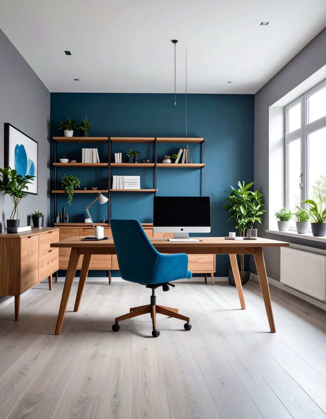
Create a productive workspace with Stonington Gray’s professional yet calming appearance. This popular shade offers blue undertones that promote focus while maintaining enough warmth to feel comfortable during long work sessions. The medium-light depth provides excellent contrast for computer screens and paperwork without creating eye strain, making it an ideal choice for workspaces. What’s the key to a successful home office color scheme? Stonington Gray serves as an ideal backdrop for both traditional wooden furniture and modern ergonomic pieces, providing a flexible and adaptable space that can accommodate your ever-changing work needs. The sophisticated undertones complement various lighting situations, from natural daylight to desk lamps, ensuring your workspace remains comfortable and inspiring throughout the day.
8. Elevating the Aesthetic: Classic Gray Hallway Design
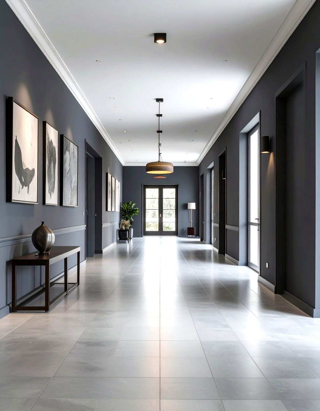
Creating a seamless transition between rooms is easier than you think with Classic Gray, a shade that effortlessly balances understated elegance with visual interest. This versatile hue creates a harmonious foundation that showcases its surroundings, from flooring to furniture, while maintaining a sophisticated appeal. By choosing Classic Gray for your hallway, you’re setting the tone for a cohesive look that lets each room shine. The neutral tone provides a perfect backdrop for showcasing artwork, family photos, and decorative lighting, ensuring your hallways feel intentional rather than transitional.
9. Welcoming Guests with Style: Useful Gray Guest Bedroom
When it comes to creating a restful retreat for overnight visitors, Useful Gray is an excellent choice. This light shade creates a sense of airiness and tranquility, making guest bedrooms feel larger and more inviting. The balanced undertones of Useful Gray work beautifully with a variety of bedding colors and styles, allowing you to tailor the look to your guests’ preferences. A neutral canvas like Useful Gray provides the perfect backdrop for adding pops of color, creating a space that feels both sophisticated and welcoming. Whether you’re looking to add a touch of elegance or a dash of whimsy, this versatile tone pairs beautifully with both cool and warm accent colors.
10. Adding Depth with Accent Walls: Chelsea Gray
Looking to add some drama to your space? Chelsea Gray is the perfect solution. This deeper shade creates a striking focal point when used as an accent wall, drawing the eye without overwhelming smaller spaces. The complex undertones of Chelsea Gray add depth and interest, while its neutrality ensures it complements existing furnishings beautifully. By incorporating Chelsea Gray into your design, you can create visual weight that adds depth to a room, providing contrast against lighter gray or white walls. This sophisticated choice works particularly well behind headboards, in reading nooks, or as a backdrop for entertainment centers.
11. Seamless Flow in Open-Concept Spaces: Edgecomb Gray
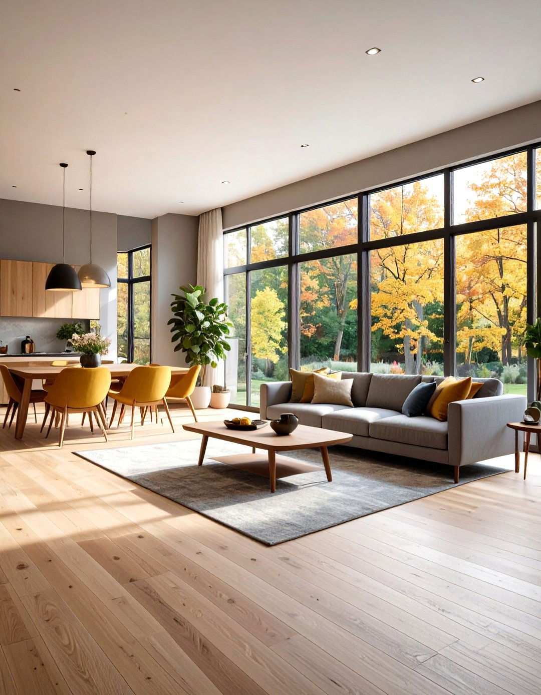
Achieving a cohesive look in open-concept homes can be a challenge, but Edgecomb Gray makes it easy. This popular shade bridges the gap between gray and beige, providing a versatile tone that works beautifully from kitchen to living room to dining area. By choosing Edgecomb Gray, you’re creating a consistent look that allows each area to maintain its unique function and personality. The warm undertones of Edgecomb Gray complement various wood tones and finishes commonly found in open floor plans, creating cohesion without monotony throughout your living spaces.
12. Elevating Spaces with Elegance
Experience the transformative power of Silver Drop’s refined, light gray presence in even the smallest of spaces. This exquisite shade skillfully expands the feeling in powder rooms while injecting enough personality to convey intentionality. The subtle undertones harmonize beautifully with metallic fixtures and mirror frames, showcasing the importance of balance in design. By opting for Silver Drop, you can make a sophisticated statement without resorting to bold, instead embracing quiet elegance that leaves a lasting impression on guests. The adaptable tone seamlessly complements various lighting styles, from modern sconces to traditional chandeliers, creating a polished first impression that also prioritizes practical functionality.
13. Designing Serenity in Nurturing Spaces
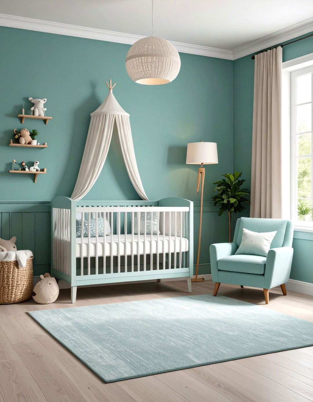
Create a haven for little ones with Misty Coast’s soothing, cool undertones, perfect for promoting rest and relaxation. This calming shade strikes a delicate balance between visual interest and serenity, allowing it to grow with your child’s ever-changing needs. The subtle blue hints create a peaceful atmosphere ideal for bedtime routines, making Misty Coast a thoughtful choice for nurseries. What sets nursery colors apart is their ability to provide a foundation that works beautifully with various themes and decorating styles. Misty Coast’s sophisticated tone offers a versatile backdrop for colorful artwork and toys, while maintaining a serene ambiance that supports healthy sleep patterns for growing children.
14. Elevating the Focal Point in Kitchen Design
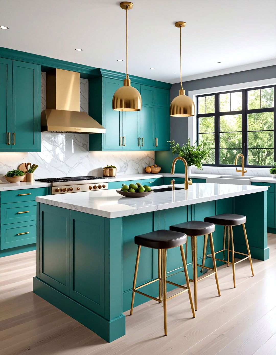
Make your kitchen island the star of the show with Platinum’s sophisticated silvery-green undertones. This elegant shade works in harmony with cabinetry, providing subtle contrast against lighter wall colors. The pale gray tone complements various countertop materials while maintaining a contemporary appeal that adds depth to kitchen design. By incorporating Platinum into your kitchen island, you can create visual separation that defines the island as both a functional workspace and gathering area. The understated elegance pairs beautifully with stainless steel appliances and modern hardware, making this refined choice an excellent addition to any kitchen.
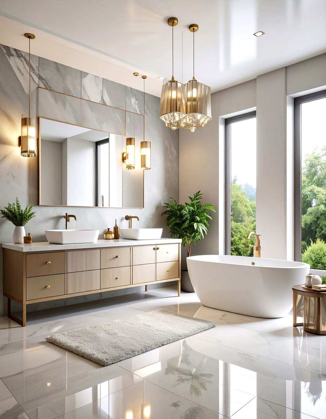
15. Crafting a Luxurious Oasis in the Master Bathroom
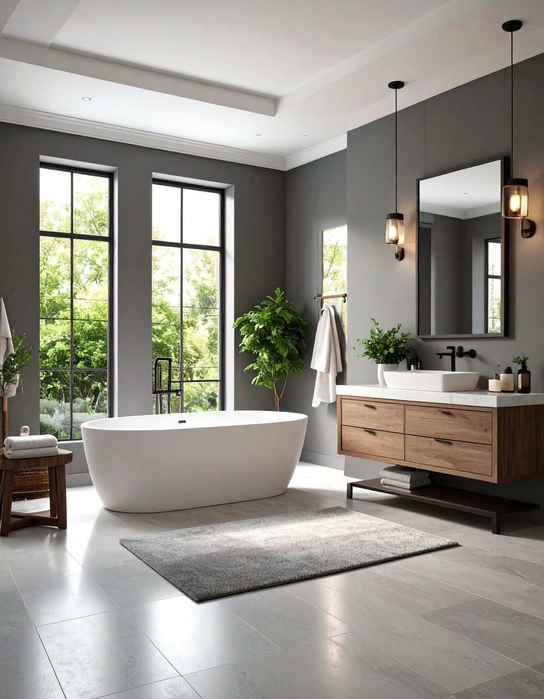
Transform your master bathroom into a haven of relaxation with Chic Gray’s versatile mid-tone presence. This sophisticated shade skillfully provides excellent contrast against white fixtures while maintaining the serene atmosphere essential for a spa-like experience. The warm beige notes prevent the space from feeling cold or sterile, instead creating a cozy retreat that invites self-care. What elements come together to make master bathrooms feel truly luxurious? Chic Gray creates a balanced backdrop that enhances marble countertops, elegant lighting, and quality fixtures. The adaptable undertones work beautifully with both chrome and gold accents, supporting the daily rituals of self-care while maintaining sophisticated appeal for years to come.
16. Elevating Spaces with Natural Gray Family Rooms
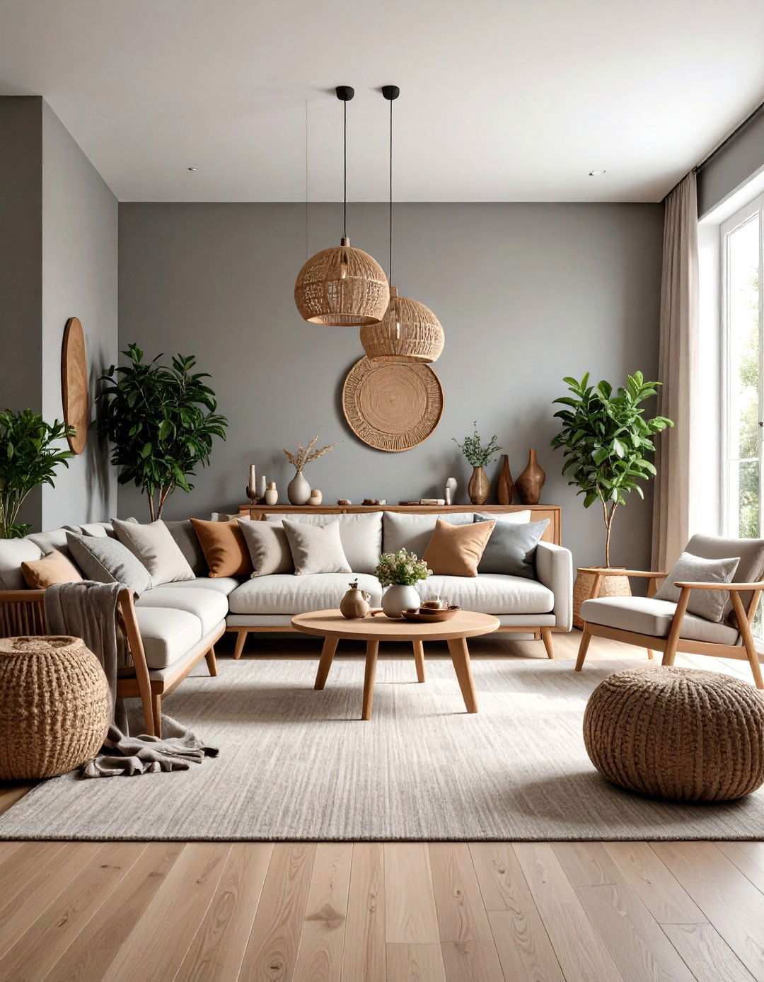
Design a family room that embodies peace and serenity with Natural Gray’s distinctive taupe nuances. This adaptable shade achieves a harmonious balance between visual interest and calming atmosphere. Effective family room colors can significantly impact daily living, making Natural Gray a practical choice for creating a space where relaxation and connection thrive. By providing a durable backdrop that conceals minor scuffs, this sophisticated tone ensures a polished appearance in main living areas.
17. Silver Bullet Laundry Room Makeover
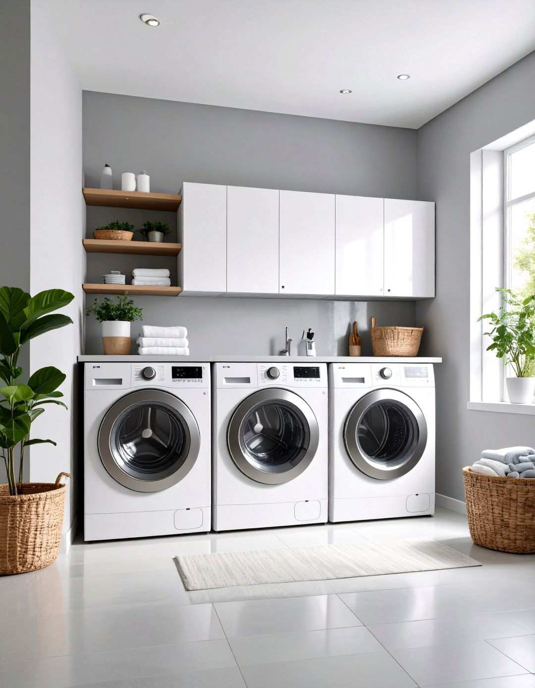
Enliven laundry tasks with Silver Bullet’s soothing mid-gray appearance and subtle lavender undertones. This balanced shade instills an organized, clean atmosphere in utility spaces, elevating their functionality and aesthetic appeal. Thoughtful color choices can greatly impact the perception of laundry rooms, making every space deserving of attention. Silver Bullet proves that laundry rooms can be transformed into areas that feel intentional and well-designed, supporting efficient household management with a refined touch. The versatile tone complements white appliances and organized storage solutions beautifully.
18. French Silver Bedroom Oasis
Craft an elegant sleeping sanctuary with French Silver’s cool, sophisticated blue undertones. This refined shade promotes restful sleep while maintaining the elegance expected in private retreats. Bedroom colors play a significant role in creating a restful environment, and French Silver excels at signaling relaxation and peace. The mid-tone depth provides excellent contrast against white bedding and trim, creating a calming atmosphere that supports healthy sleep patterns. The sophisticated undertones complement both traditional and contemporary bedroom furniture beautifully, making this choice a thoughtful one for creating a personal sanctuary.
19. Adding Depth with Silver Feather Ceiling Designs
Enhance any room’s ambiance with Silver Feather’s pale gray appearance and gentle green undertones. This elegant shade works beautifully on ceilings, adding depth and visual interest without overwhelming room proportions. Ceiling colors can significantly impact room dynamics, and Silver Feather creates subtle contrast that defines architectural details while expanding the sense of space. The refined undertones complement various wall colors and decorating styles beautifully, transforming overlooked surfaces into design elements that contribute to overall room sophistication and visual interest.
20. Serene Sanctuary Reading Nook
Design a tranquil retreat with Solemn Silence’s soft gray tones and calming blue undertones, perfect for creating an atmosphere conducive to reading and introspection. This understated shade expertly opens up smaller spaces while fostering a sense of serenity. The subtle elegance it exudes encourages focus and concentration, making it an ideal choice for built-in shelving and comfortable seating. By incorporating Solemn Silence into your reading space, you can create a dedicated area that promotes quiet contemplation, intellectual pursuits, and personal growth. The sophisticated tone adds an air of refinement to the space, making it an extension of your home’s character.
21. Inviting Entryway in Gratifying Gray
Make a lasting first impression with Gratifying Gray’s light base and subtle green-yellow undertones. This versatile shade strikes a perfect balance between durability and visual appeal, making it an excellent choice for high-traffic areas. The harmonious coloring works seamlessly with various flooring materials and architectural details, creating a cohesive look. By selecting Gratifying Gray for your entryway, you can set the tone for a welcoming atmosphere that carries throughout the house. The adaptable tone complements both warm and cool accent colors, providing endless possibilities for seasonal decorations. This thoughtful choice adds an air of sophistication to daily arrivals and departures, leaving a lasting impression on visitors.
22. Versatile Spaces with Tranquil Gray
Design flexible spaces that adapt to changing needs with Tranquil Gray’s delicate taupe-gray balance. This understated shade feels neither too warm nor too cool, making it an excellent choice for rooms that serve multiple functions, such as home gyms or craft rooms. The harmonious undertones support various activities and moods throughout the day, creating a sense of continuity. By incorporating Tranquil Gray into your multi-purpose room, you can create a space that feels intentional and well-designed, regardless of its primary function. The sophisticated tone complements various storage solutions and equipment beautifully, ensuring the space remains functional and appealing.
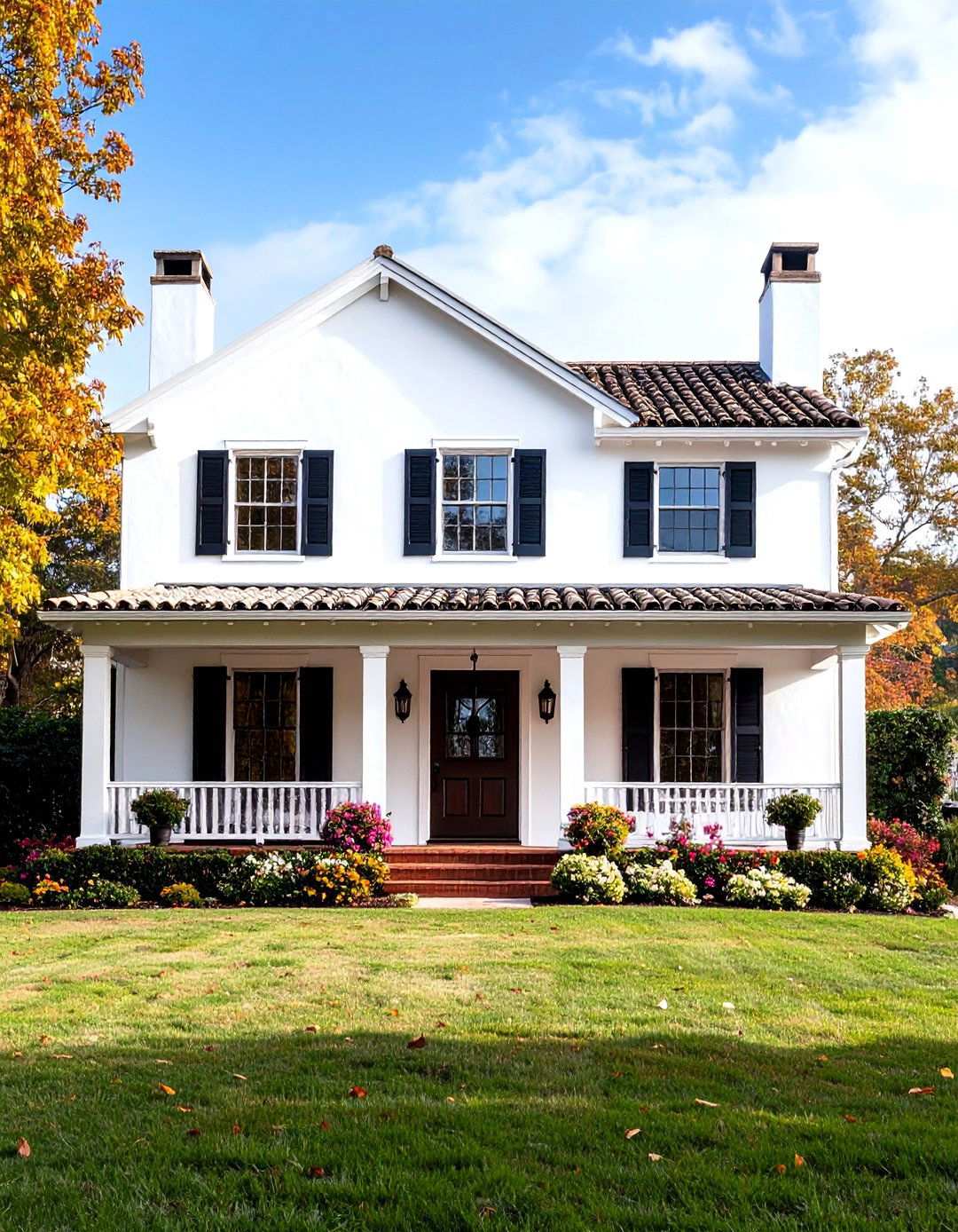
23. Elevating Home Aesthetics with Dark Ash
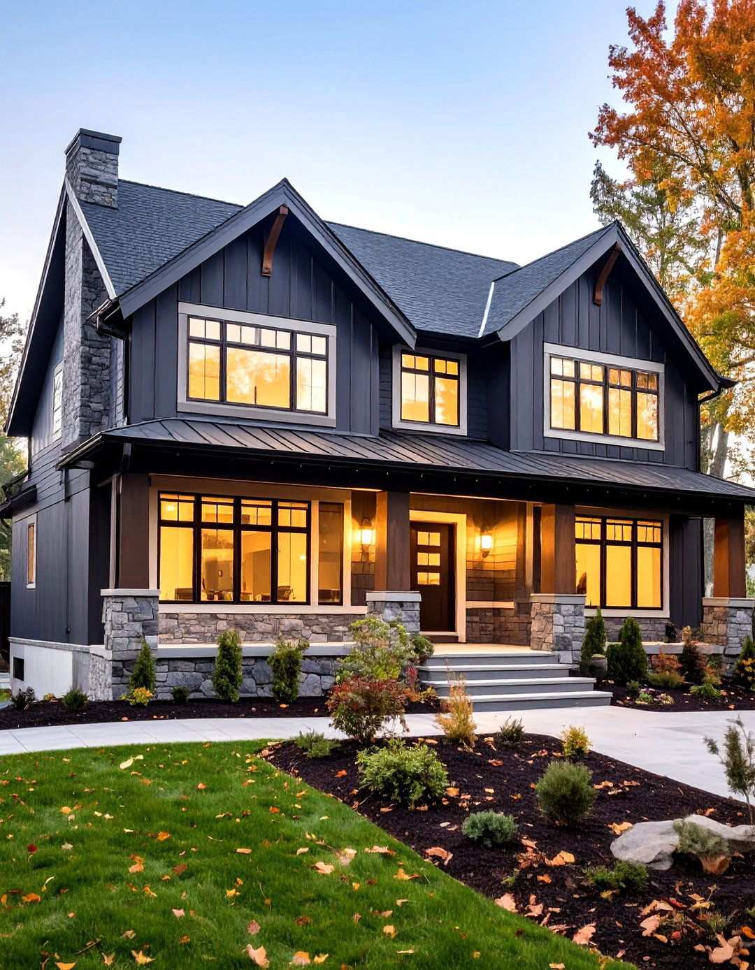
Dark Ash’s unique blend of warm undertones and mid-dark gray hue presents an unparalleled opportunity to make a bold statement with exterior siding. Its refined presence offers exceptional versatility in exterior applications, effortlessly contrasting with crisp white trim to create a contemporary look. The nuanced depth of Dark Ash beautifully complements various architectural styles and roofing materials, adding a timeless element to any home’s façade. By choosing Dark Ash, homeowners can significantly enhance their home’s value and curb appeal, as it cleverly highlights architectural details while appealing to a broad range of tastes. This thoughtful choice ensures that the exterior of the home remains stylish and relevant for years to come, making a lasting impression on neighborhood aesthetics and elevating the overall design.
24. Adding Depth with Graycloth Interior Accents
Graycloth’s distinctive cool gray character, subtly infused with gentle lavender undertones, offers a sophisticated solution for interior accents. This refined shade works beautifully on built-in cabinetry, feature walls, and other design elements, adding a touch of elegance to any room. The complex undertones of Graycloth introduce a captivating visual element, elevating entire room compositions while maintaining its neutral versatility. By incorporating Graycloth into interior design schemes, homeowners can add depth and personality to their spaces, distinguishing thoughtfully designed interiors from ordinary decorating efforts. The balanced undertones of Graycloth beautifully complement various decorating styles and color palettes, providing the perfect finishing touches that transform good rooms into exceptional spaces.