1. Elevating Style with Distressed Chalk Painted Furniture
A beautifully distressed dresser can instantly infuse a bedroom with warmth and character. By applying a soft neutral chalk paint in shades like Paris Grey or Old White, and then strategically sanding down edges and corners, you can create a vintage appearance that’s reminiscent of years of loving use. This technique is particularly appealing because the matte finish of the chalk paint contributes to the overall aged look while remaining surprisingly easy to work with. To achieve the perfect distressed effect, focus your efforts on areas that would typically show signs of wear and tear, such as drawer fronts, top surfaces, and ornate details. For added depth and visual interest, consider layering different colors underneath the main coat. The beauty of this approach lies in its imperfect, authentic appearance, which tells a story of generations of love and use.

As an Amazon Associate I earn from qualifying purchases.
2. Two-Tone Kitchen Makeovers: A Timeless Design Trend
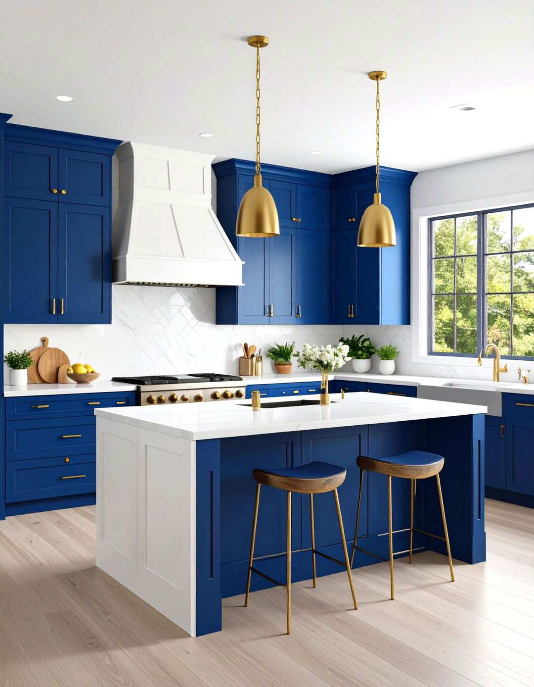
When it comes to kitchen design, why settle for a single color scheme when a two-tone approach can add sophistication and visual interest? By combining light upper cabinets with darker lower ones, or painted cabinet boxes with natural wood doors, you can create a design that’s both functional and aesthetically pleasing. Popular combinations include pairing white upper cabinets with navy blue lowers, or sage green cabinets with warm wood tones. This technique not only helps define kitchen zones but also adds architectural interest to otherwise plain cabinetry. To achieve a balanced look, consider painting only the cabinet frames while leaving doors natural, or reverse this approach for a different effect. The key is to ensure that the two colors complement your existing kitchen elements, such as countertops and backsplashes, and maintain a harmonious balance. By incorporating two-tone cabinets into your kitchen design, you can instantly modernize traditional layouts and create a space that’s both timeless and trendy.
3. Elevating Dining Rooms with Gradient Magic
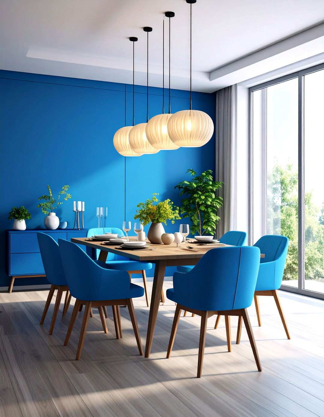
To infuse your dining space with an air of dynamism, why not experiment with the enchanting world of gradient effects? By masterfully blending multiple hues within a single color family across furniture surfaces, you can create visually striking transitions from light to dark. This captivating technique works particularly well on dining tables, chairs, and buffets when consistently applied across the entire set. Begin with the lightest shade and gradually introduce deeper tones, working in a smooth, wet-on-wet manner to achieve seamless blending. Chair backs offer an ideal canvas for showcasing vertical gradient effects, while table legs can display stunning horizontal gradients. When selecting color families, consider those that harmoniously complement your dining room’s overall palette, such as soothing blues for a coastal theme or warm earth tones for a rustic ambiance. Achieving professional-looking results requires patience, quick working times, and a steady hand.
4. Captivating Farmhouse Flair with Milk Paint Storage Benches
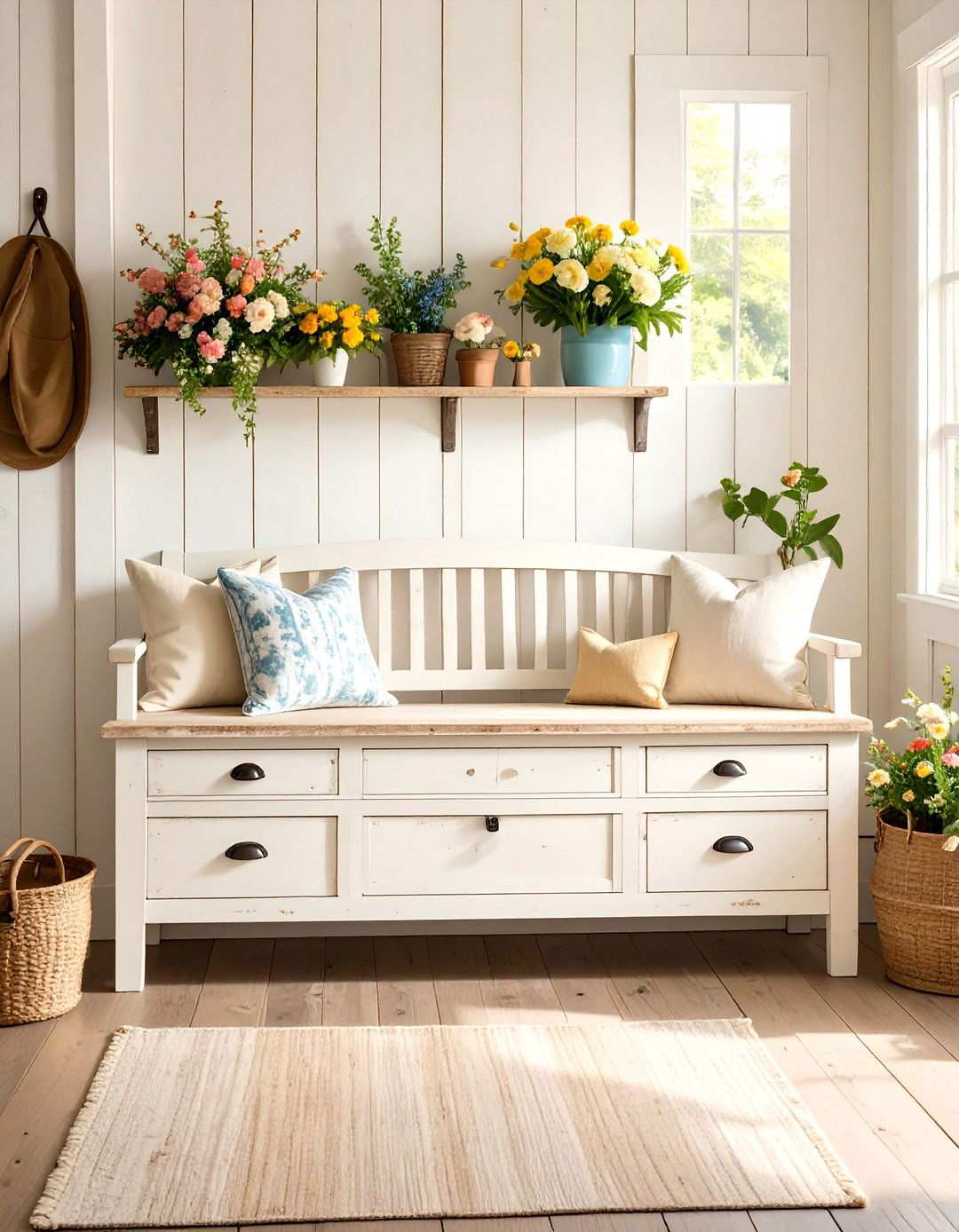
What’s the secret to conjuring that authentic farmhouse charm that effortlessly blends rustic and refined elements? Milk paint, with its innate texture variations and subtle color depth, is the perfect solution. Storage benches adorned with milk paint in colors like Grain Sack or Ironstone develop a beautiful patina effect over time, imbuing them with an air of aged sophistication. The water-based formula allows for chippy, weathered finishes that seem authentically aged, while adhering differently to various wood types creates unique organic variations that enhance the handmade appearance. To achieve the desired look, apply multiple coats for solid coverage or opt for thin applications to showcase the underlying wood grain. For added protection and a matte finish, seal the piece with natural wax.
5. Modern Coffee Table Makeovers with Geometric Patterns
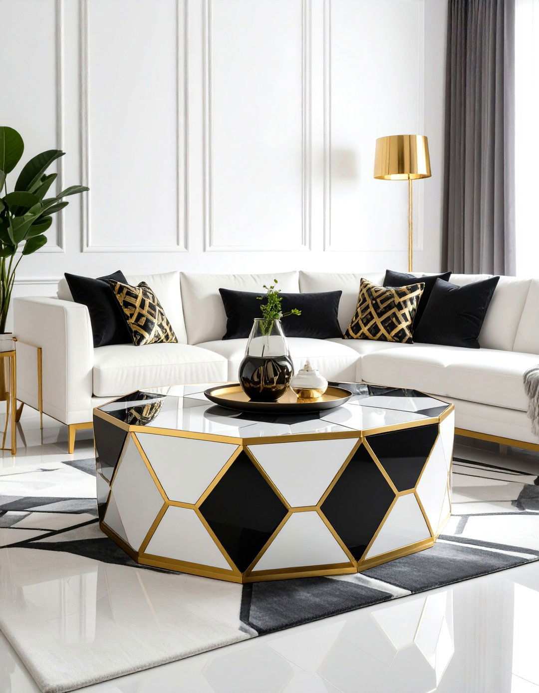
Are you looking to inject a touch of modern sophistication into your living room furniture? Geometric patterns can transform a simple coffee table into a stunning contemporary statement piece with strategic use of painter’s tape and contrasting colors. Popular designs include hexagonal honeycomb patterns, Art Deco triangles, or simple stripe combinations. The precision required for clean geometric lines makes this technique particularly rewarding when executed flawlessly. To create a design that reflects current trends, choose color combinations like black and white for timeless appeal or warm terracotta with cream for an earthy vibe. Metallic accents within geometric patterns add a luxurious touch without overwhelming the design. Success depends on careful measuring, high-quality painter’s tape, and patient application techniques that ensure crisp, professional-looking results.
6. Metallic Accents for Nightstand Makeovers
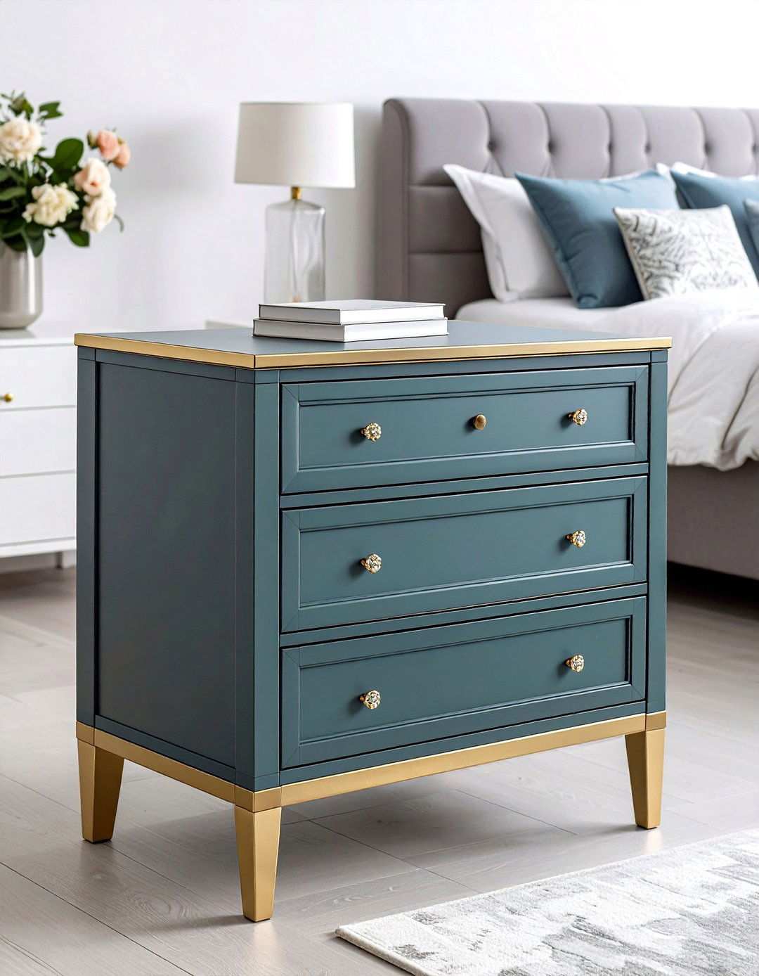
To infuse bedroom furniture with understated glamour, consider strategic metallic applications. By focusing these accents on specific elements of nightstands, such as drawer pulls or decorative molding, you can create sophisticated focal points that beautifully reflect light. Pair metallic finishes – gold leaf, copper paint, or silver highlighting – with complementary matte base colors like navy, sage green, or charcoal for a striking contrast. This harmonious blend of textures and finishes adds depth to otherwise simple furniture pieces. By applying metallic finishes over dark wax for an aged appearance or using them sparingly for a more subtle look, you can elevate basic nightstands into stylish bedroom accessories that seamlessly integrate with various décor styles.
7. Moroccan Tile-Inspired Sideboard Makeovers
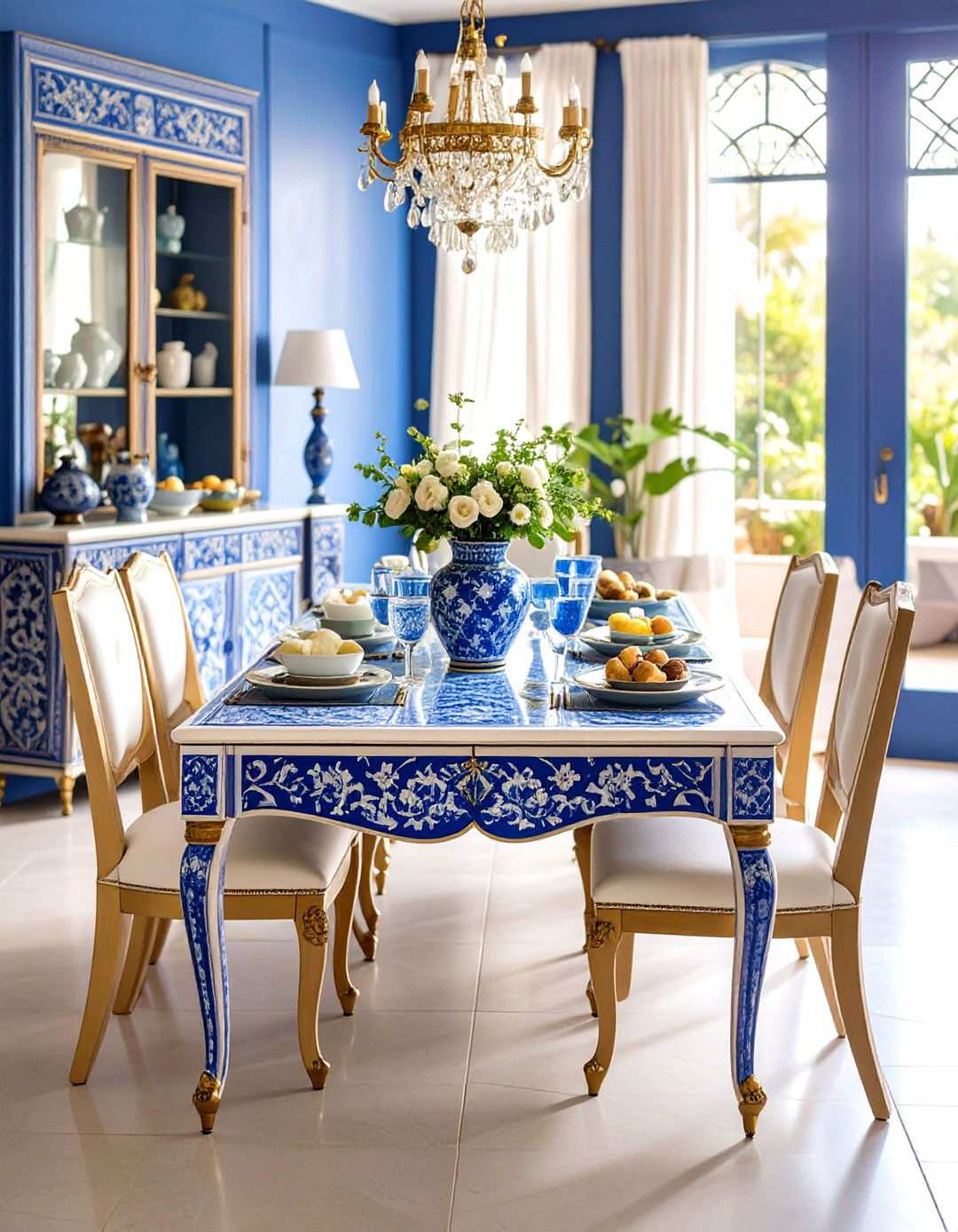
What sets ordinary sideboards apart from extraordinary conversation pieces? The application of rich, saturated Moroccan tile stencils can instantly transform these pieces into functional works of art. The intricate patterns work particularly well on large, flat surfaces such as sideboard doors and drawer fronts. Authentic color combinations like deep blues and whites or warm oranges with gold accents create a captivating Mediterranean-inspired look. To achieve professional results, it’s essential to carefully place stencils and apply paint consistently. Consider mixing and matching different stencil designs within the same color family to add an extra layer of visual complexity. To ensure the longevity of these striking pieces, seal stenciled surfaces with protective topcoats, especially on frequently used dining room furniture.
8. Capturing Coastal Chic with Weathered Window Benches
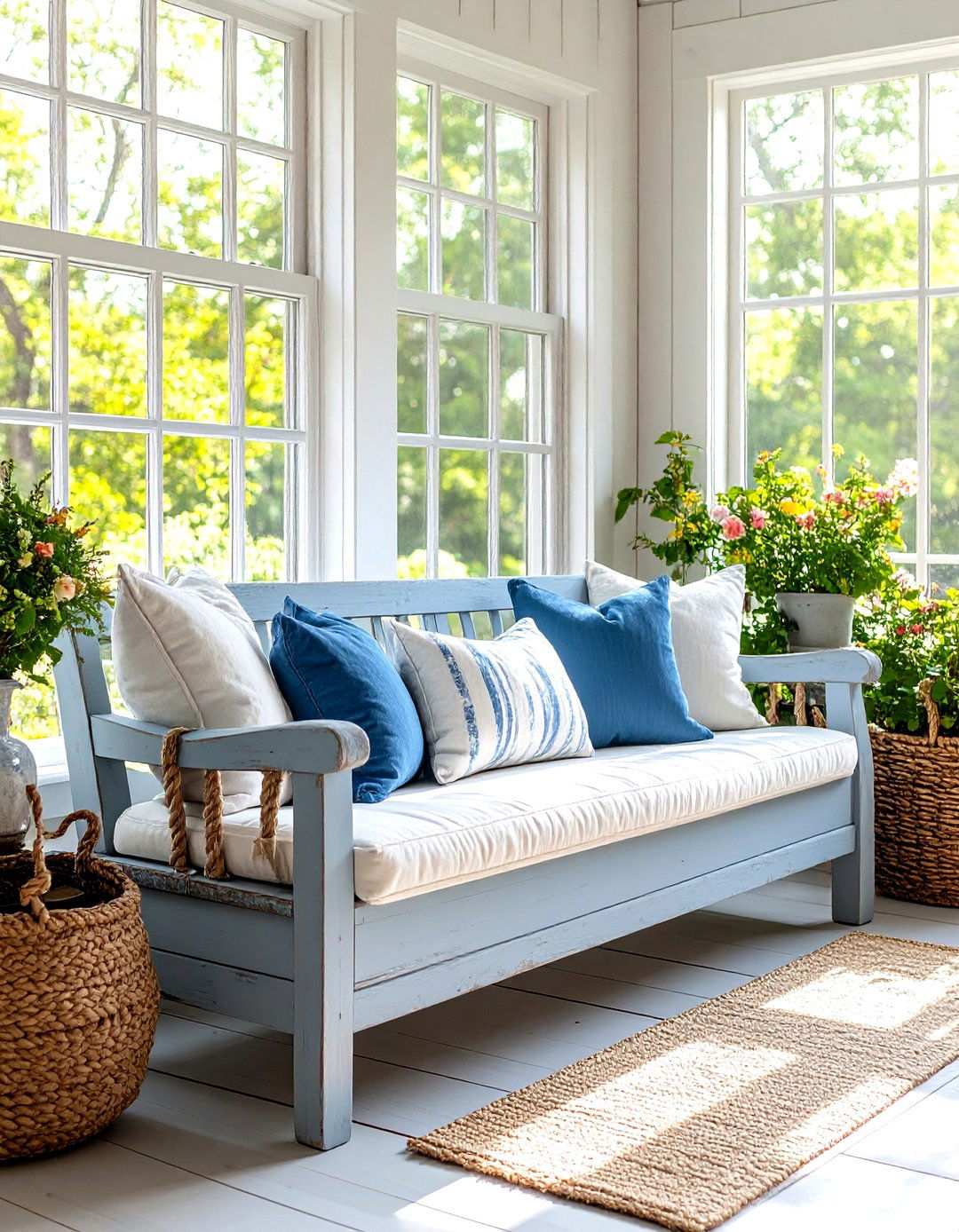
There’s something undeniably inviting about coastal homes, don’t you think? To replicate that laid-back seaside atmosphere in your own space, try applying weathered painting techniques to window benches. By layering base coats in driftwood grays or weathered blues and then partially removing lighter topcoats, you can simulate years of salt air exposure. Focus on creating realistic wear patterns around edges, corners, and seat areas where natural weathering would occur. Dry brushing with white or cream highlights adds a sun-bleached appearance characteristic of coastal furniture. The key is finding that perfect balance between worn and well-maintained that defines casual coastal elegance. These techniques work beautifully on both new and vintage furniture pieces, allowing you to effortlessly capture the essence of the coastal style.
9. Elevating Wardrobes to Artistic Status
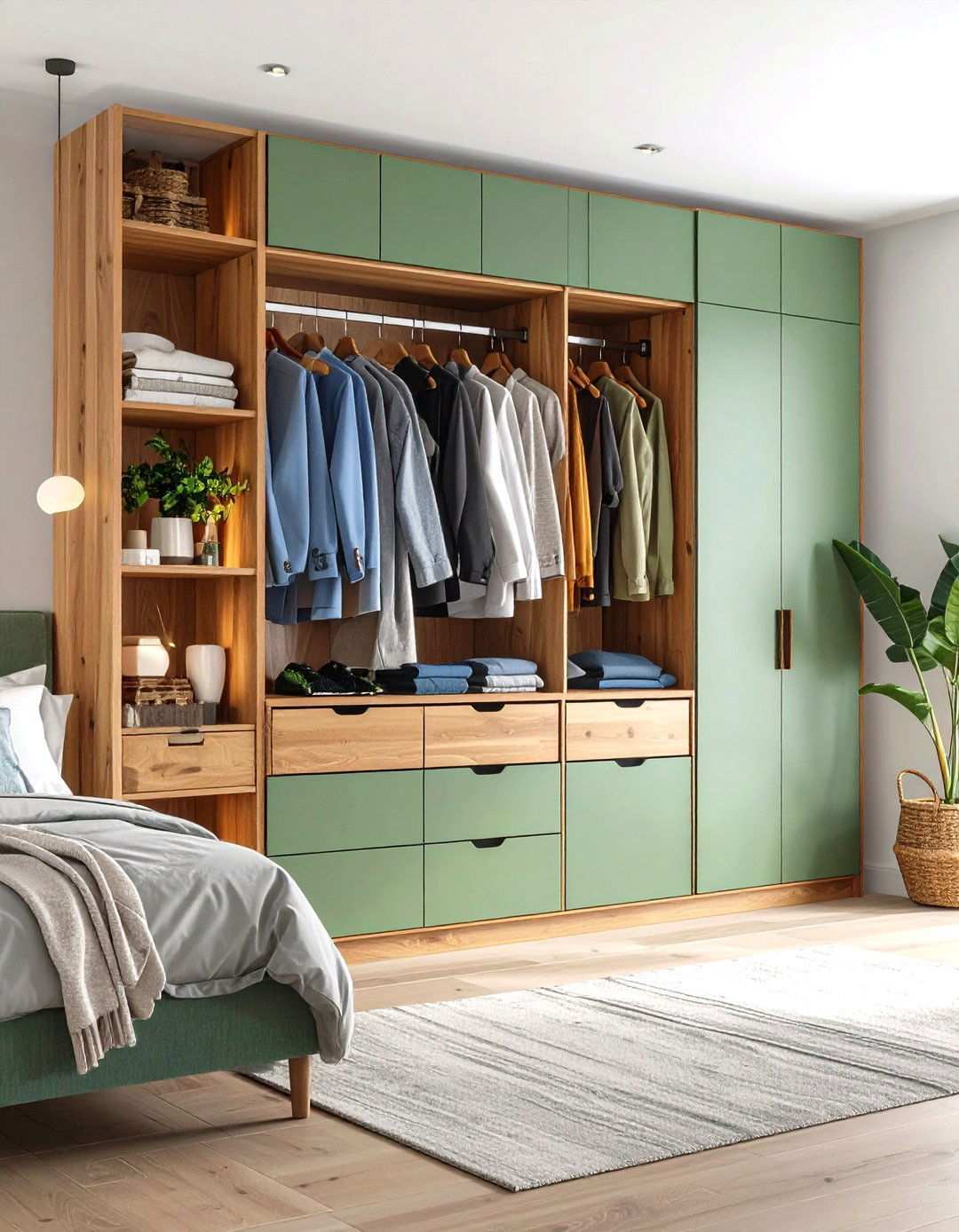
By embracing bold color-blocking techniques, wardrobes can transcend their utilitarian purpose and become stunning architectural statements. This design approach is particularly well-suited to modern and mid-century furniture styles, where clean lines and geometric shapes provide a perfect canvas for creative expression. One effective way to incorporate color-blocking is to divide the wardrobe surface into distinct sections, painting the top third in a vibrant hue and the bottom two-thirds in a complementary color. Alternatively, vertical divisions can be used to create a striking visual impact. Popular combinations include warm wood tones paired with soft sage green, or classic navy paired with crisp white sections. The key to success lies in striking a balance between the blocked sections, ensuring that the colors harmonize with the surrounding room and create a sophisticated ambiance.
10. Crafting Antique Patina on Bookcases
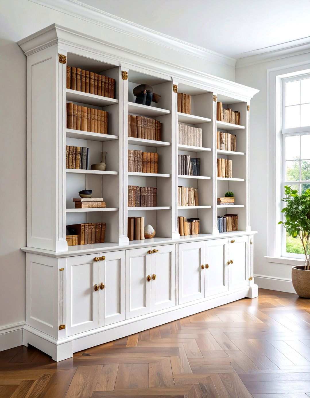
Achieving the perfect aged patina on new furniture requires a thoughtful combination of technique and creative flair. By applying an antique white base coat followed by a selective application of dark wax in recessed areas, bookcases can be transformed into treasured antiques. This technique is particularly effective on bookcases with intricate molding, carved elements, or raised panel doors. To create a convincing aged appearance, apply dark wax to corners, crevices, and detailed areas, while leaving flat surfaces lighter to enhance the contrast. The key to a successful patina lies in working the wax while it is still pliable, allowing for smooth gradations from dark to light. By mastering this classic technique, ordinary bookcases can be elevated into sophisticated library-worthy pieces that complement a wide range of traditional and transitional décor styles.
11. Painting Unique Personality onto Chest Drawers

For those looking to inject some artistic flair into their home décor, hand-painted furniture is an increasingly popular trend. By incorporating delicate floral motifs painted directly onto chest surfaces, individuals can create personalized pieces that reflect their unique style and creativity. While basic painting skills are required, this technique offers complete customization of colors, flower types, and placement patterns, making it an accessible and engaging creative outlet. To get started, consider simple designs like roses, daisies, or botanical branches, before attempting more complex compositions. When choosing background colors, opt for hues that enhance rather than compete with floral elements, such as soft grays, warm creams, or muted sage greens. To protect the hand-painted designs, apply multiple clear topcoat layers to ensure longevity. These artistic pieces are perfect for bedrooms, guest rooms, or anywhere personality-driven décor is desired.
12. Elevating Home Office Design with Gradient Blues
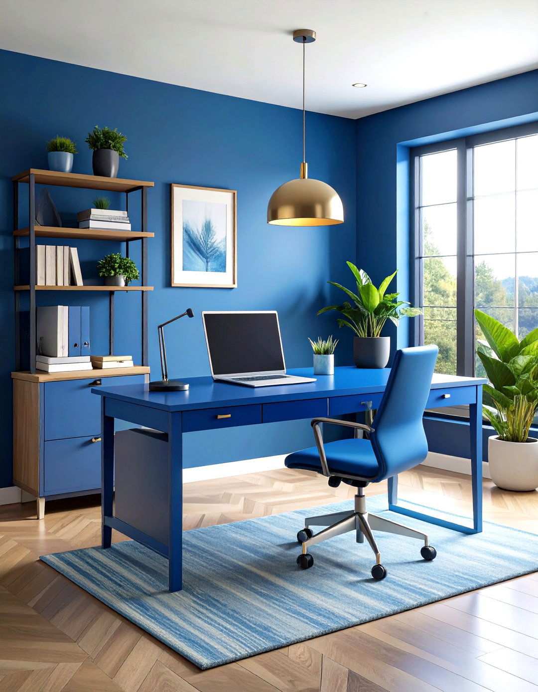
Effective home office furniture can strike a balance between creativity and professionalism. By incorporating gradient blue techniques, workspace environments can be transformed into calming and energizing spaces that promote focus and visual interest. This color progression, transitioning from deep navy at the bottom to light sky blue at the top, adds a sense of dynamism to potentially monotonous office spaces. To achieve this look, apply gradient techniques to desk legs, side panels, or drawer fronts while keeping work surfaces neutral for functionality. The psychological effects of blue tones enhance concentration and productivity, making this both aesthetically pleasing and practical. For seamless color transitions, work quickly during application to maintain wet edges. Adding subtle white highlights can simulate natural lighting effects, further enhancing the gradient appearance throughout different times of day.
13. Bringing Rural Charm to Modern Living with Rustic Red Entertainment Centers
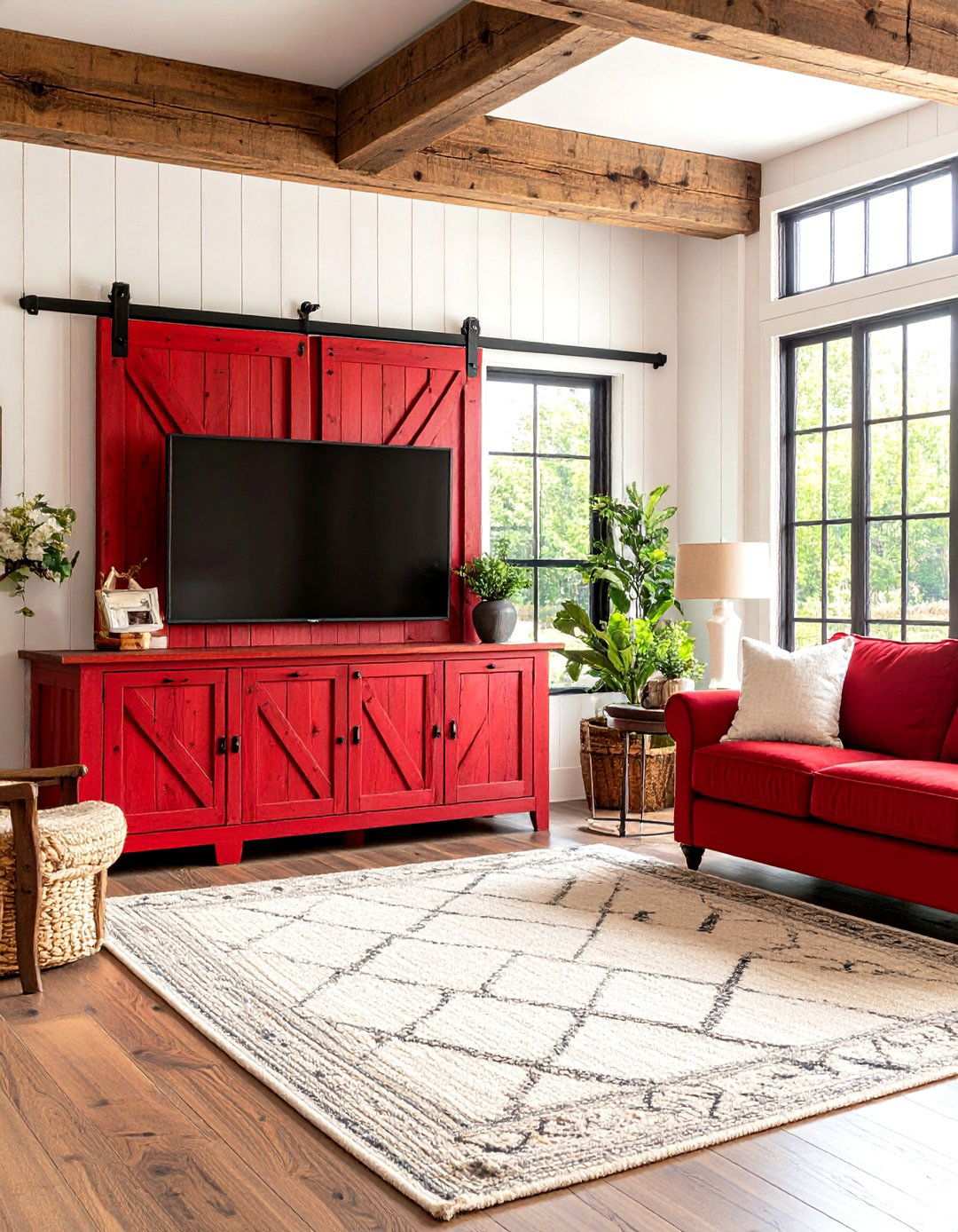
Authentic farmhouse warmth can be seamlessly integrated into modern living spaces through rustic red paint applications on entertainment centers. This classic aesthetic provides both contemporary functionality and a nostalgic charm. To achieve this look, use milk paint or chalk paint in deep barn red shades and then distress edges and corners for an authentic weathered appearance. Layering different red tones adds depth and visual complexity, mimicking years of natural aging. Focus distressing efforts on areas that would receive natural wear, such as door edges, corners, and around hardware. The rich red color serves as a striking focal point in neutral room schemes, adding a touch of rustic charm. To preserve the paint and allow continued aging effects, seal with matte wax.
14. Timeless Neutrals: The Versatility of Linen Press Armoire Updates
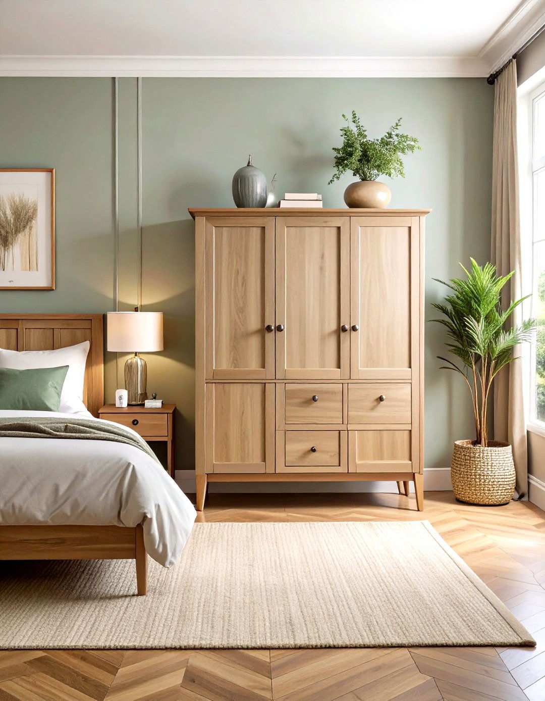
Neutral colors have a timeless quality that never goes out of style in furniture design. Linen press armoires painted in sophisticated neutrals like mushroom gray, warm putty, or soft taupe provide versatile storage solutions that complement any décor evolution. These timeless colors allow other room elements to shine while providing subtle sophistication. To add depth and visual interest, consider layering multiple neutral tones without overwhelming smaller spaces. Combining painted finishes with natural wood elements adds texture and warmth. The beauty of neutral painted furniture lies in its adaptability to changing design trends and color schemes. To protect these investment pieces, apply protective topcoats to high-use areas while maintaining the desired matte finish.
15. Transforming Room Ambiances with Bold Accent Chairs
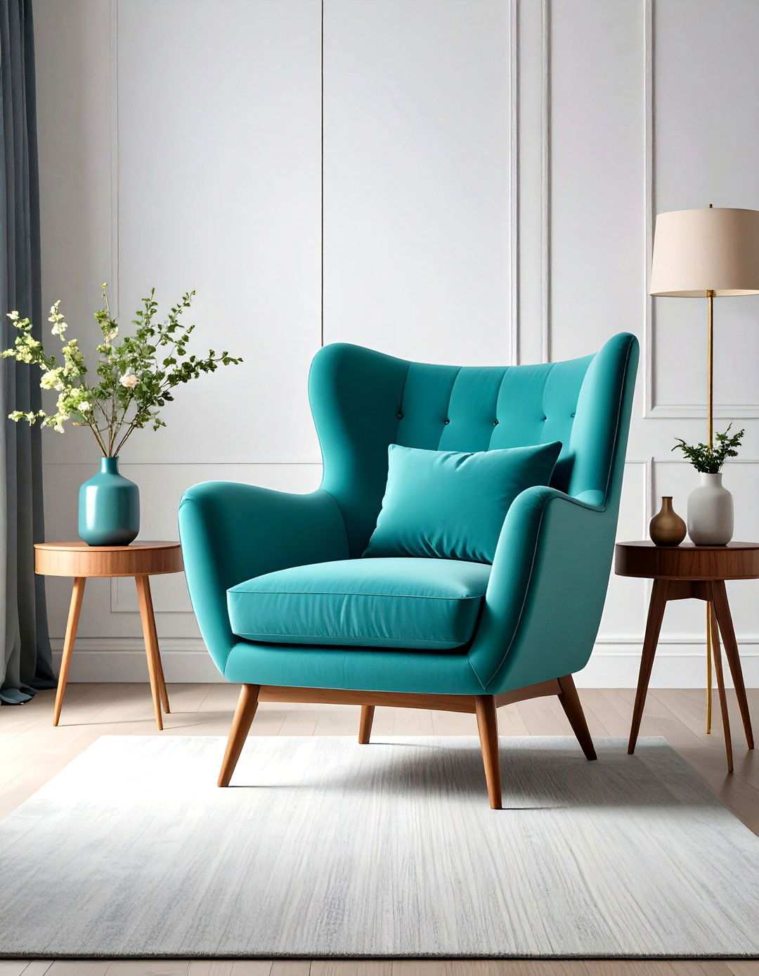
Single furniture pieces have the power to revolutionize entire room atmospheres, injecting a burst of energy into neutral spaces while reflecting the latest color trends. Bold turquoise painted accent chairs, in particular, stand out as vibrant focal points that capture attention and ignite conversation. This fearless color choice works particularly well on vintage chair frames with intricate shapes or architectural details, adding an extra layer of visual interest. Before painting, it’s essential to prepare surfaces properly for optimal paint adhesion, especially on previously finished pieces. The intensity of turquoise allows these chairs to become living works of art while maintaining their functionality as seating. When selecting specific turquoise shades, consider the room’s lighting, as natural and artificial light can significantly affect color appearance. To ensure the longevity of bold painted finishes, apply a protective topcoat to shield the vibrant color from wear and tear. By strategically applying color, these statement pieces demonstrate how ordinary furniture can be transformed into extraordinary design elements.
16. Crafting a Clean Aesthetic with Scandinavian White Dining Tables
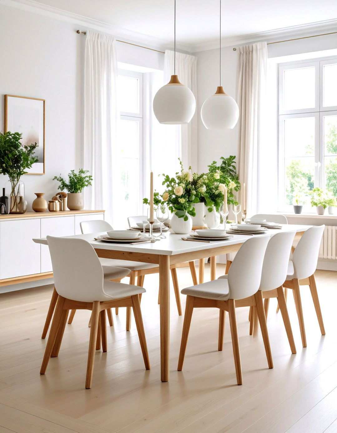
Scandinavian design philosophy is characterized by a clean, minimalist aesthetic that emphasizes simplicity and functionality. Pure white painted dining tables embody this philosophy, providing a neutral foundation for colorful accessories and tableware. Achieving perfectly smooth, even coverage is crucial to this technique, eliminating brush marks and imperfections that can detract from the clean lines characteristic of Scandinavian furniture. To enhance the smooth finish, sand between coats until the surface is glass-like. White dining tables can brighten spaces and provide a versatile backdrop for a wide range of decorating styles. The key to success lies in proper surface preparation and quality paint application techniques. Consider combining painted white surfaces with natural wood elements to create authentic Scandinavian contrast, adding warmth and depth to the space. To maintain the pristine appearance of these pieces, apply a durable topcoat specifically designed for dining table use, ensuring they withstand daily wear and tear.
17. Incorporating Vintage Medical Aesthetics with Green Apothecary Cabinets
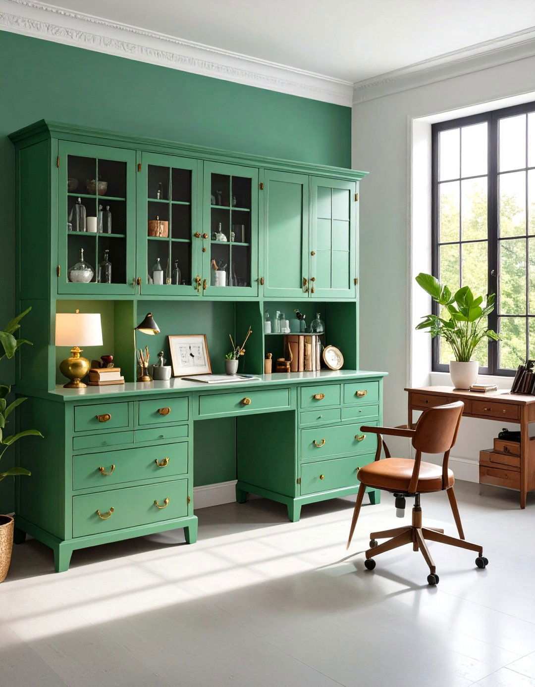
For those drawn to the nostalgic charm of vintage medical and scientific aesthetics, apothecary-style cabinets painted in authentic vintage green shades offer a unique opportunity to bring old-world elegance into modern spaces. These sophisticated pieces work beautifully in kitchens, bathrooms, or home offices where organized storage meets historical charm. To achieve a genuine vintage look, use muted sage or forest green tones that reflect the subtle coloring of antique apothecary cabinets. Apply paint in thin, even coats to achieve the smooth finish characteristic of professional apothecary furniture. Consider adding authentic-looking labels or numbering systems to enhance the medical theme, creating a sense of authenticity and historical significance. To add a touch of realism, distress lightly around edges and hardware for a subtle aging effect. These unique pieces serve as functional storage while adding conversation-worthy historical references to contemporary spaces.
18. French Provincial Curved Leg Tables – Timeless Elegance Reimagined
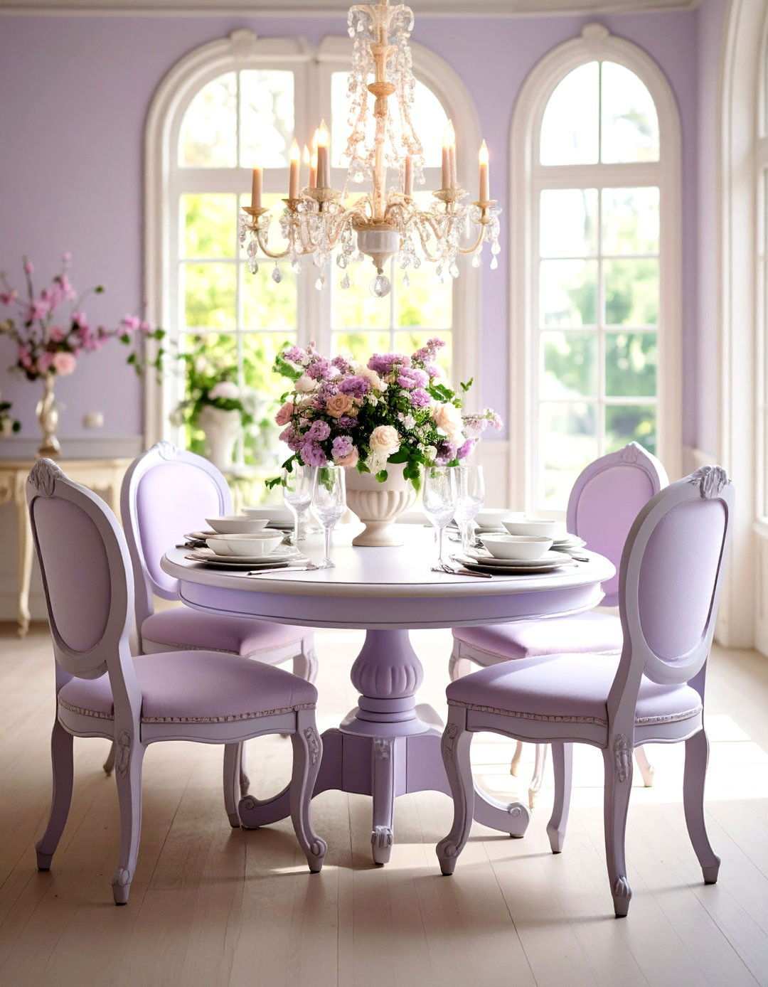
French Provincial furniture’s enduring appeal can be attributed to its masterful blend of refinement and rustic charm. Curved leg tables, painted in soft blues, warm creams, or gentle lavenders, perfectly capture the romantic essence of provincial French design. Achieving this look requires meticulous attention to curved surfaces and ornate details during the painting process. To ensure smooth coverage on intricate elements and turned legs, employ high-quality brushes specifically designed for detailed work. The perfect balance between elegance and rustic charm is what defines authentic French Provincial style, and it’s precisely this balance that’s so alluring. For added depth and character, consider incorporating subtle antiquing techniques around carved areas. These stunning pieces look fantastic in formal dining rooms, entryways, or anywhere sophisticated European charm is desired in modern home settings.
19. Modern Black Kitchen Island Updates – A Bold Statement Piece
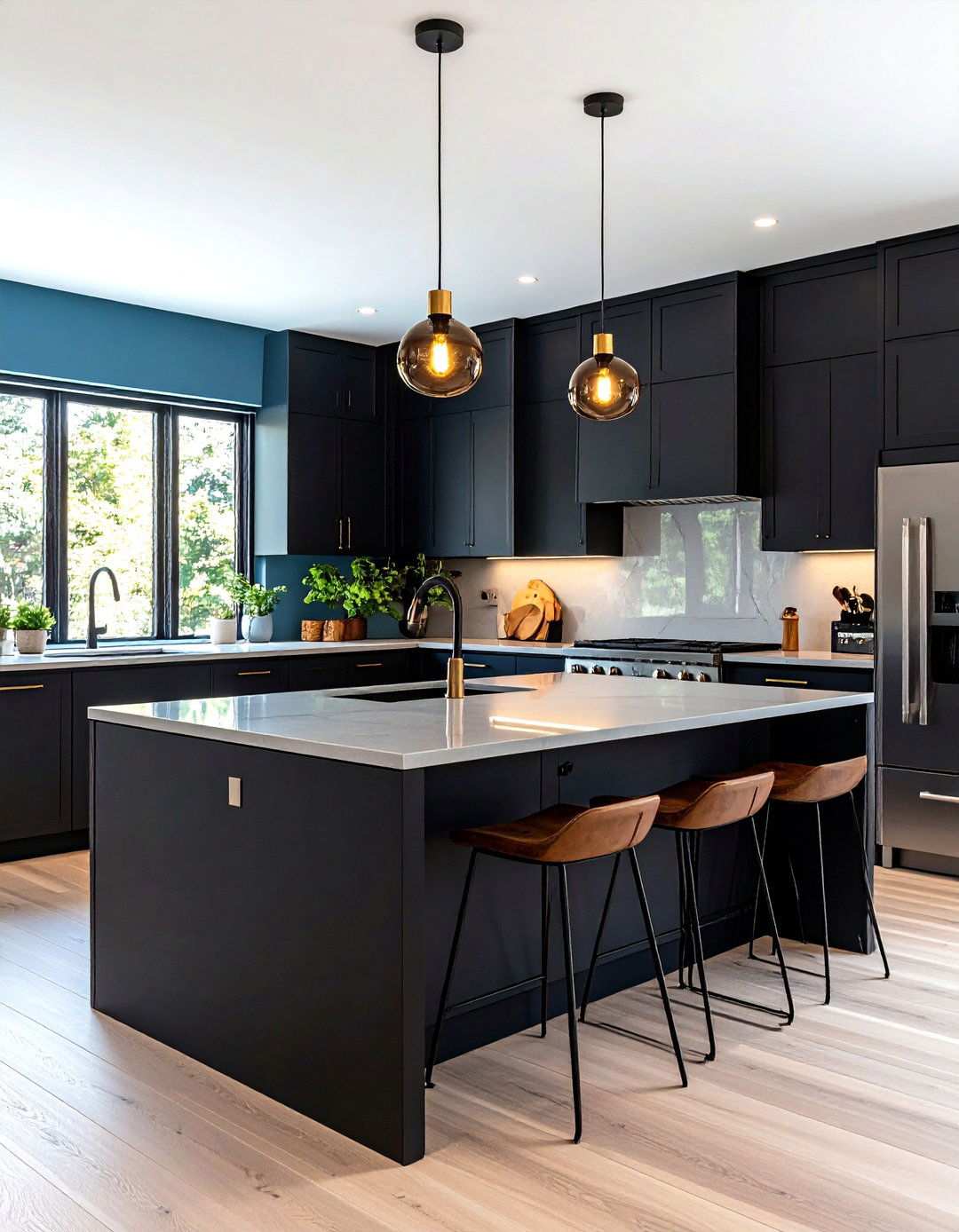
Kitchen islands can become showstopping focal points that anchor entire culinary spaces with the right design approach. Modern black painted finishes create striking contrast against lighter cabinetry, resulting in timeless elegance that effortlessly transcends design trends. This bold choice is particularly effective in contemporary and transitional kitchen designs where dramatic elements significantly enhance overall sophistication. To ensure durability against moisture, heat, and daily cleaning requirements, choose high-quality paints specifically designed for kitchen use. The depth of black surfaces allows decorative hardware and countertop materials to take center stage while creating a stunning visual impact. For a contemporary look, opt for matte black finishes, while satin sheens offer easier maintenance. These striking islands serve as functional workspaces while making powerful design statements that elevate entire kitchen aesthetics to professional levels.
20. Distressed Gray Farmhouse Bed Frames – Capturing the Perfect Lived-In Look
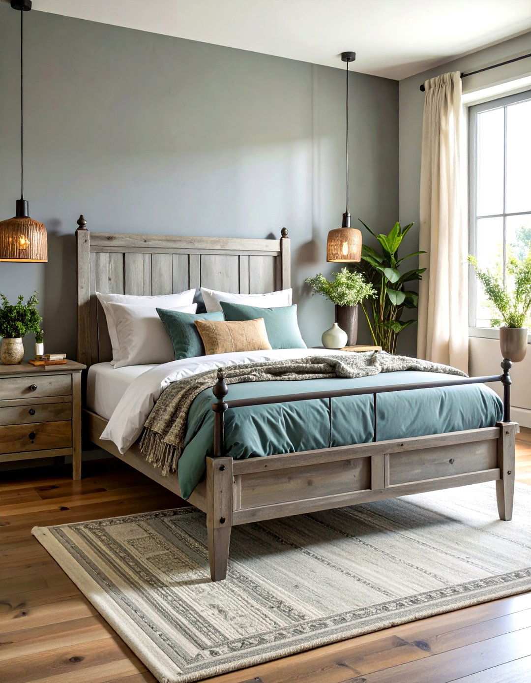
What makes bedrooms feel like peaceful retreats is a perfect blend of comfort and tranquility. Distressed gray painted bed frames effectively capture farmhouse authenticity while providing sophisticated neutrals that work seamlessly with various décor styles. This technique involves layering different gray tones and strategically removing paint to simulate natural aging patterns. Focus your distressing efforts on headboard details, footboard edges, and areas that would naturally receive wear over time. The beauty lies in achieving realistic wear patterns that suggest years of use without appearing artificially damaged. For authentic matte finishes that enhance the rustic aesthetic, use quality chalk paint or milk paint. Seal distressed areas with clear wax to preserve the effect while allowing continued subtle aging. These comfortable pieces anchor bedrooms with understated farmhouse elegance.
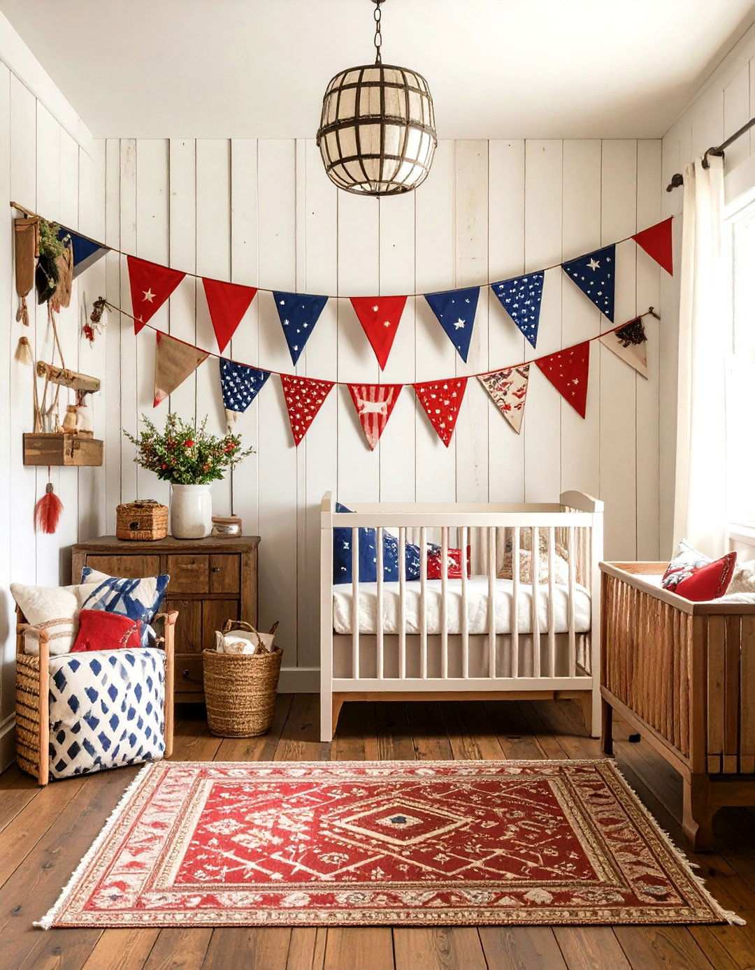
21. Energetic Yellow Children's Furniture Collections
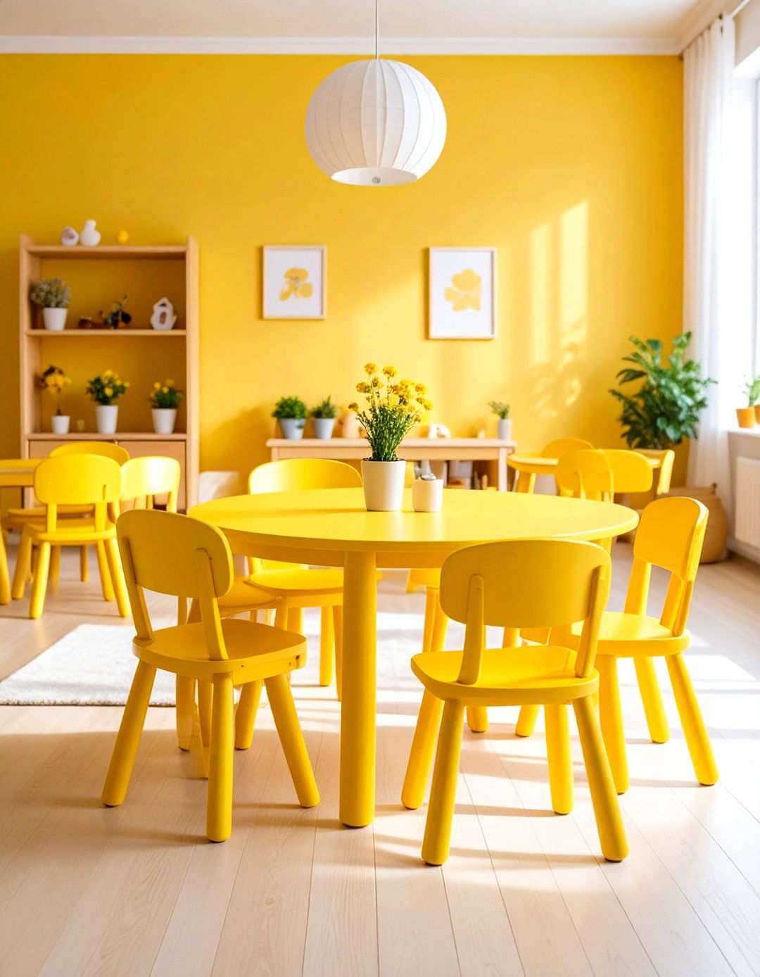
A well-chosen color palette can significantly impact the ambiance and functionality of a children’s space. Yellow-painted furniture sets bring an invigorating atmosphere to nurseries and playrooms, fostering a sense of creativity and wonder. This bold color choice works particularly well on compact tables, stools, and storage units, creating a visually appealing and stimulating environment. To ensure the longevity of these vibrant pieces, select high-quality paints that can withstand frequent cleaning and heavy use. The psychological effects of yellow contribute to a sense of happiness and creativity, making it an excellent choice for children’s furniture. For a balanced look, consider combining yellow with neutral tones or natural wood accents that can grow with the child.
22. Distressed Brushstroke Console Table Finishes
Adding texture and visual interest to a console table design can elevate its aesthetic appeal. By incorporating intentional brushstroke textures through specific paint application techniques, you can transform a plain surface into a tactile art piece. This approach works beautifully with textured paints that retain the brush marks when applied correctly. Varying brushstroke directions and pressures can create unique, hand-crafted appearances that suggest artisan construction. To enhance the texture’s visibility, choose colors with a high contrast ratio, such as deep blues or warm grays. The goal is to achieve a consistent inconsistency that appears deliberate rather than haphazard. These artistic techniques work exceptionally well in entryways, behind sofas, or anywhere sculptural furniture elements can add to the overall design sophistication.
23. Multifaceted Painted Storage Ottoman Projects
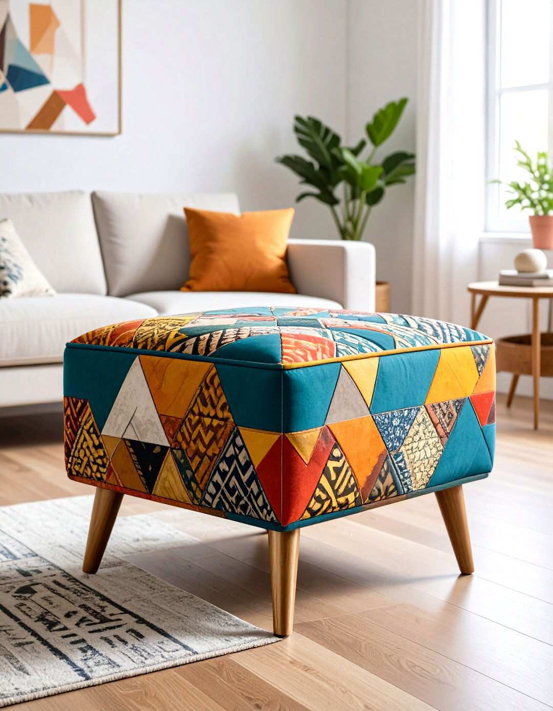
For those looking to explore the boundaries of creative furniture painting, mixed media approaches offer an exciting opportunity. By combining multiple painting techniques, such as color-blocking, stenciling, and distressing, on a single ottoman piece, you can create a truly unique and visually striking design. This technique allows you to experiment with various trends and create a piece that reflects your personal style. Consider combining geometric patterns with organic brushwork or metallic accents with matte base colors for sophisticated contrast. The compact size of ottomans makes them an ideal testing ground for bold techniques before applying them to larger pieces. To ensure harmony, use high-quality materials throughout the project. These creative pieces not only provide functional seating but also serve as artistic expressions that demonstrate advanced painted furniture techniques.
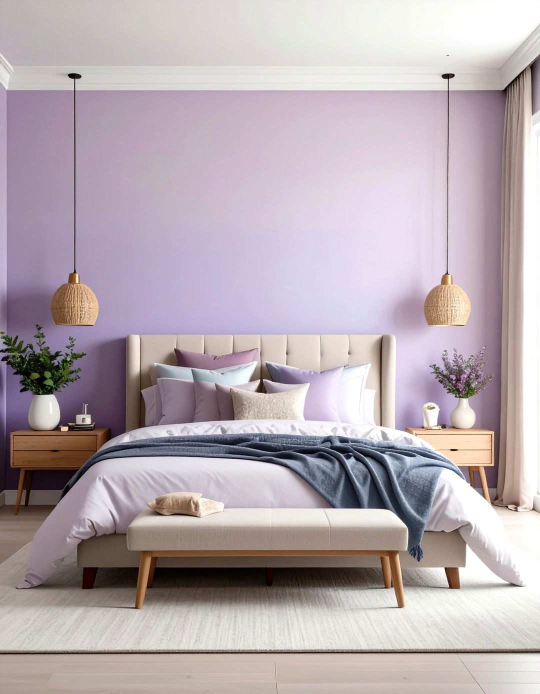
24. Elevating Elegance with Purple Velvet Chairs
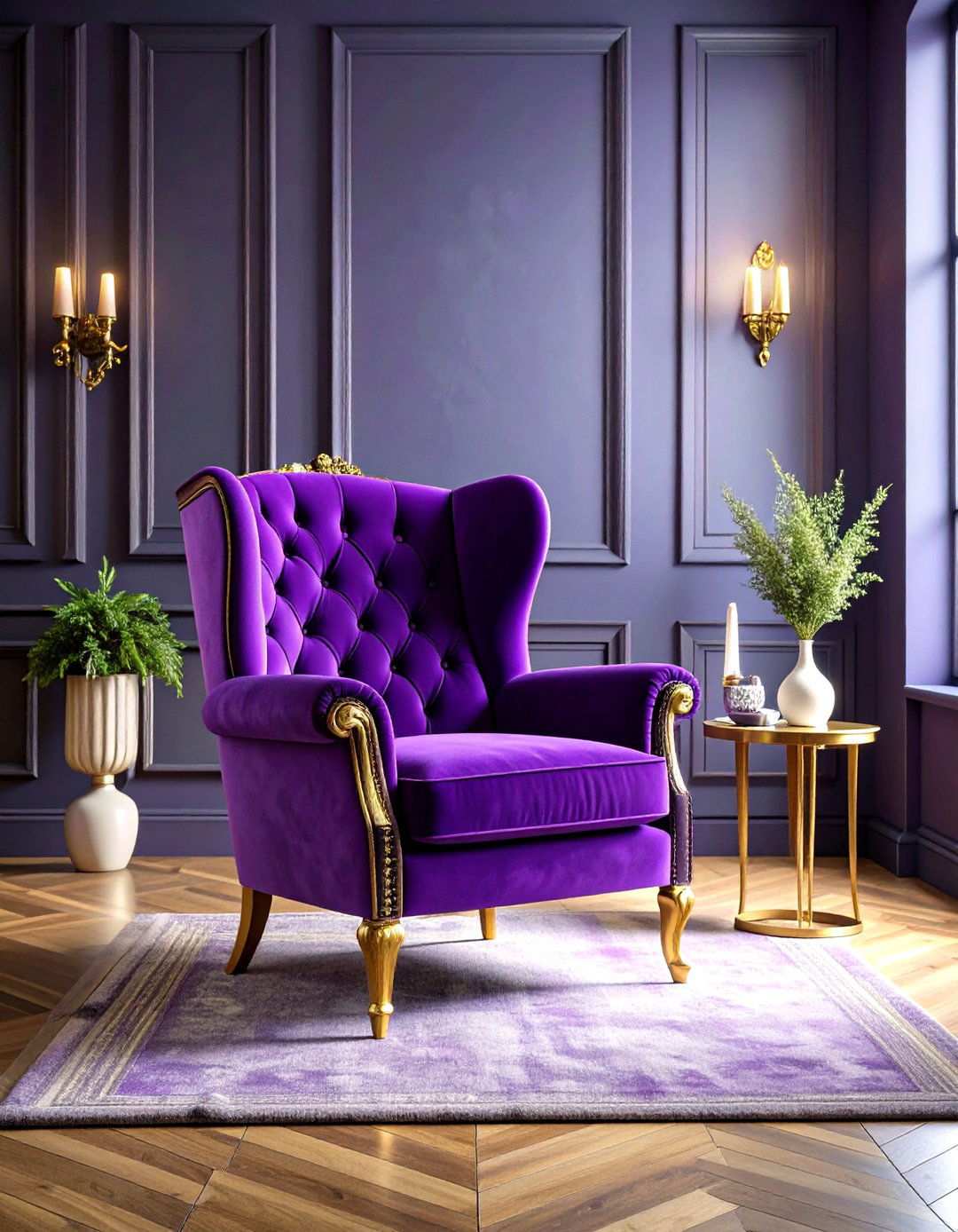
Incorporating thoughtfully painted chair frames can significantly enhance the luxury of velvet or silk upholstery, creating a visually stunning and refined aesthetic. By pairing sophisticated purple finishes on chair frames with plush, luxurious fabrics, you can establish a seamless fusion that elevates the overall design of a room. This harmonious combination works particularly well in formal settings such as living rooms, master bedrooms, or home offices, where elegant seating plays a pivotal role in making a lasting design impression. To achieve this cohesive look, select purple shades that harmonize with the upholstery colors, taking into account undertones and the effects of varying lighting conditions. When applying paint, use thin, even coats to achieve a smooth finish that complements the expensive fabrics rather than overpowering them. The ultimate goal is to create a seamless integration between the painted elements and upholstered surfaces, resulting in a refined and sophisticated design that anchors the room scheme with elegance.