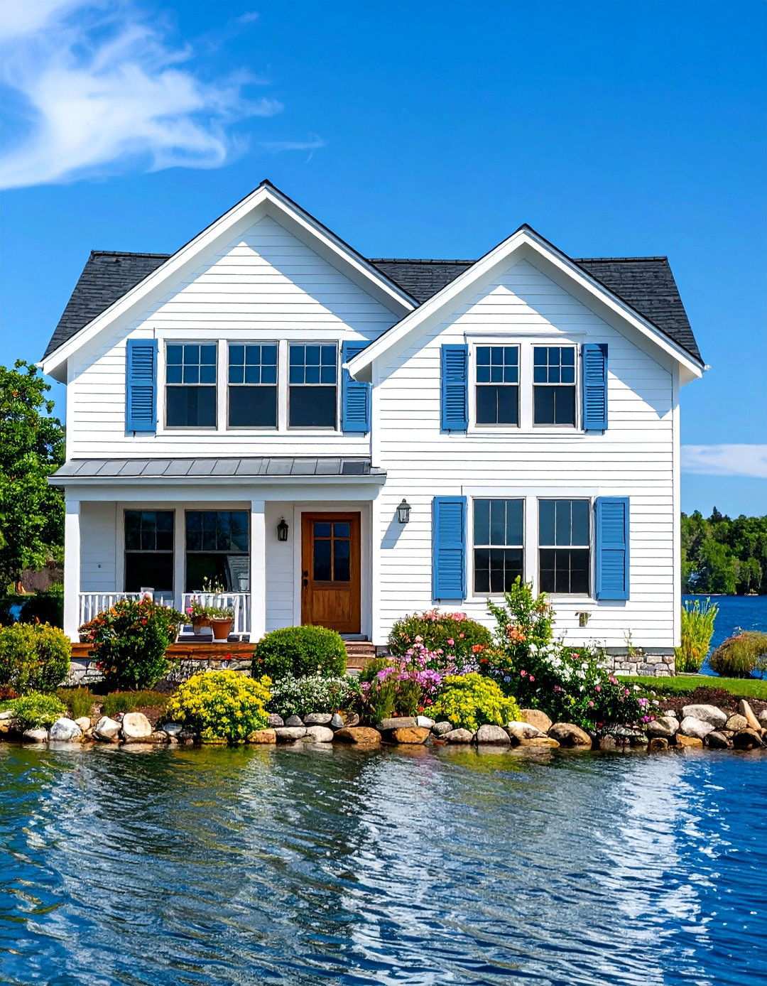
1. Classic American Elegance with Painted Brick
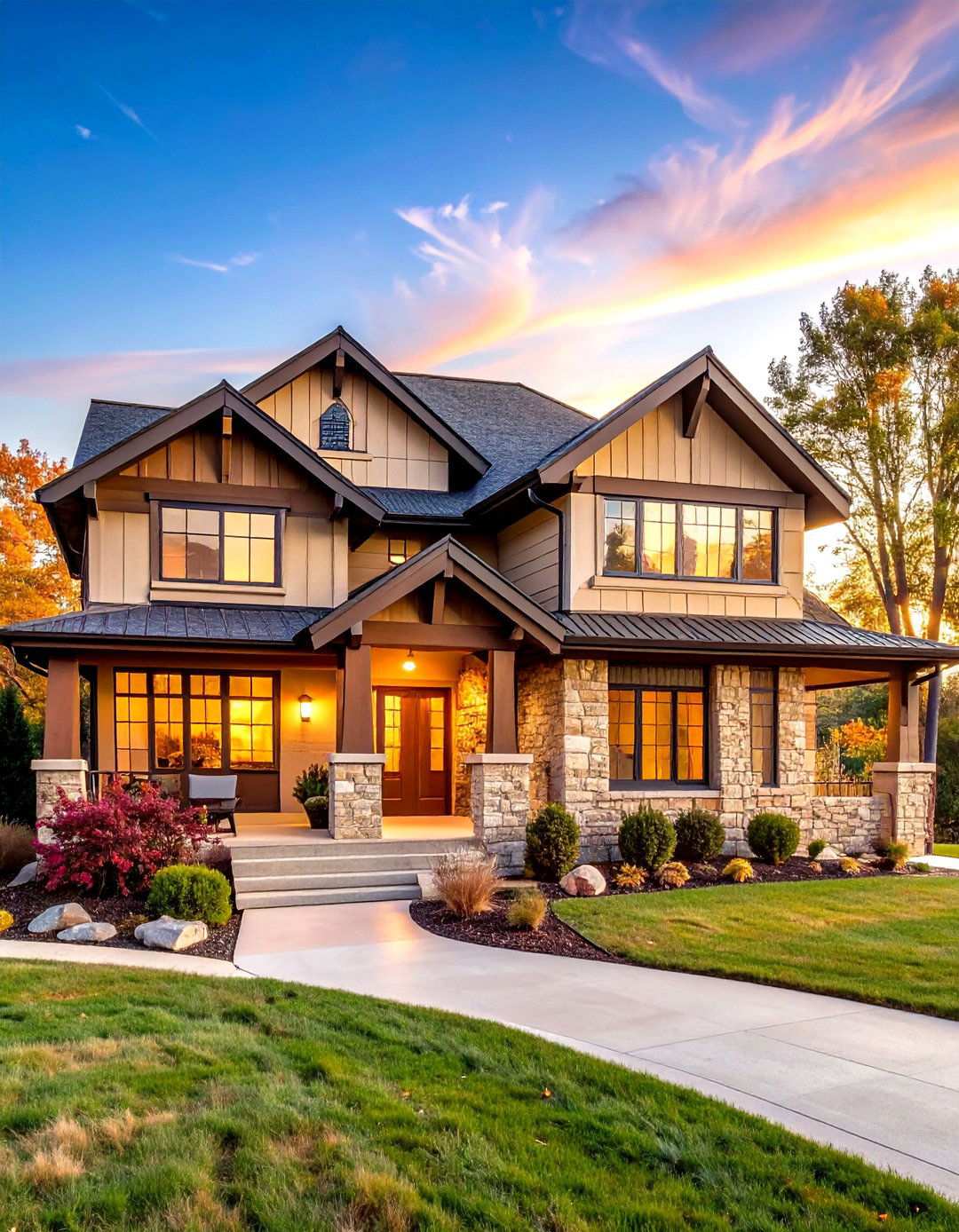
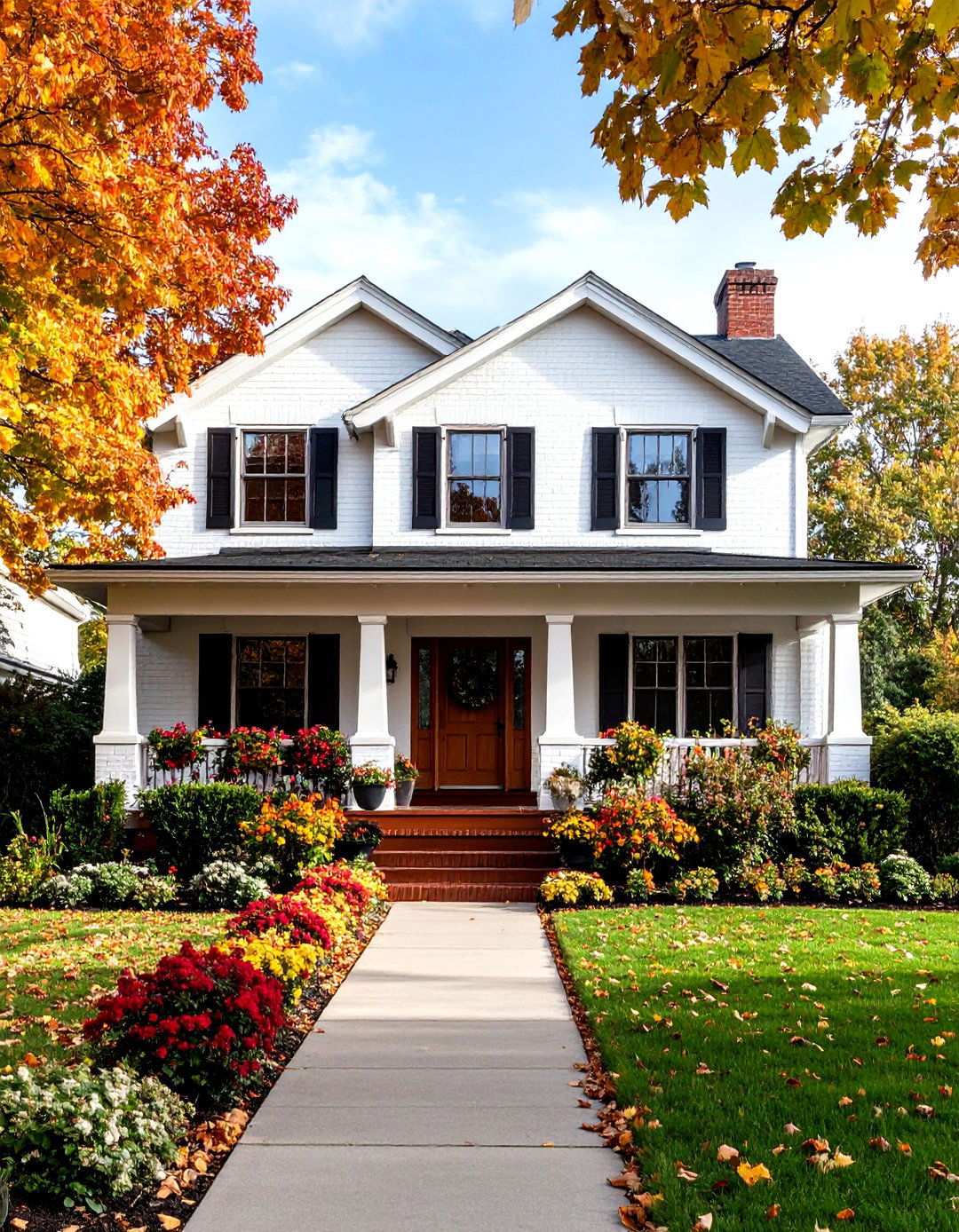
Timeless beauty and enduring charm characterize traditional farmhouses with crisp white painted brick. This classic design choice offers a clean and bright appearance that brings architectural details to the forefront, while providing a neutral backdrop for vibrant landscaping. To strike the perfect balance between rustic and refined, pair the white brick with striking black shutters and a warm wood front door. This harmonious combination works beautifully on almost any farmhouse style exterior and never goes out of style. To get the most out of this design, it’s essential to select the right undertone – opt for warm whites with subtle cream or yellow hints rather than stark, cool whites. Adding traditional elements like wraparound porches, wooden window boxes, and vintage-style outdoor lighting will lend a touch of old-world charm to the finished exterior. Completing the look with bright white window trim and lush greenery softens the overall appearance and adds a crucial element of curb appeal.

As an Amazon Associate I earn from qualifying purchases.
2. Nature-Inspired Sophistication with Sage Green
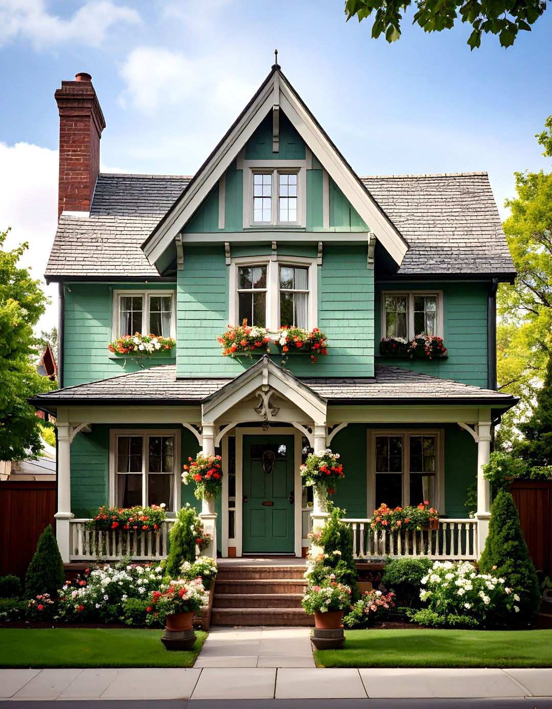
For a design that effortlessly blends with its surroundings, sage green dominates 2025’s exterior paint trends as a muted yet versatile tone that harmonizes beautifully with nature. This soothing color has a profound impact on Tudor-style brick homes, elevating them to new heights of sophistication while honoring their architectural heritage. The soft green tone complements Tudor’s characteristic steep rooflines and decorative half-timbering perfectly. Sage green pairs stunningly with white trim or warm wood accents, and it’s a wonderful complement to design elements and architectural styles like craftsmanship or cottages. For added depth and visual interest, choose deeper forest green for trim elements. This color combination works particularly well on homes surrounded by mature landscaping, as the green tones blend seamlessly with natural foliage, creating a tranquil and calming atmosphere that’s perfect for busy homeowners seeking a peaceful retreat from urban life.
3. Charcoal Gray Contemporary Colonial Revival
Charcoal gray is poised to be a standout shade in 2025, lending itself perfectly to modern exteriors that blend seamlessly with natural materials such as wood, stone, and brick. This bold choice skillfully updates Colonial architecture, injecting a dash of contemporary flair while retaining its classic proportions. Against a backdrop of charcoal gray, crisp white window trim creates a striking visual contrast, imbuing the facade with a sense of sophistication and depth. Charcoal gray also proves to be a versatile choice for traditional homes, particularly when paired with stylish design elements such as copper gutters or gold-toned light fixtures. To prevent the color from feeling overpowering, balance the bold exterior with lighter architectural details and warm metal accents like bronze or brass hardware. The charcoal gray exterior provides a dramatic canvas for colorful landscaping and seasonal decorations, showcasing your personal style and neighborhood character.
4. Warm Greige Craftsman Style Revival
Achieve the perfect harmony between gray and beige with a warm greige painted brick Craftsman home that exudes a sense of understated sophistication. Pale Oak by Benjamin Moore is an excellent neutral option for painted brick houses, providing a beautiful contrast for darker trim colors or windows while complementing natural accents like wood, copper, and stone. This refined color choice beautifully highlights Craftsman architectural features such as exposed rafter tails, thick columns, and deep eaves. The greige base allows natural materials to take center stage while providing a warm and welcoming ambiance. For a cohesive look, pair the greige base with rich brown or forest green trim colors that pay homage to the Arts and Crafts movement’s connection to nature. As a bonus, gray beiges are incredibly versatile and can seem to outlast trends, making them a practical choice for homeowners who plan to repaint their house every decade or so. Add copper or bronze light fixtures to complete the authentic Craftsman aesthetic and create a sense of timelessness.
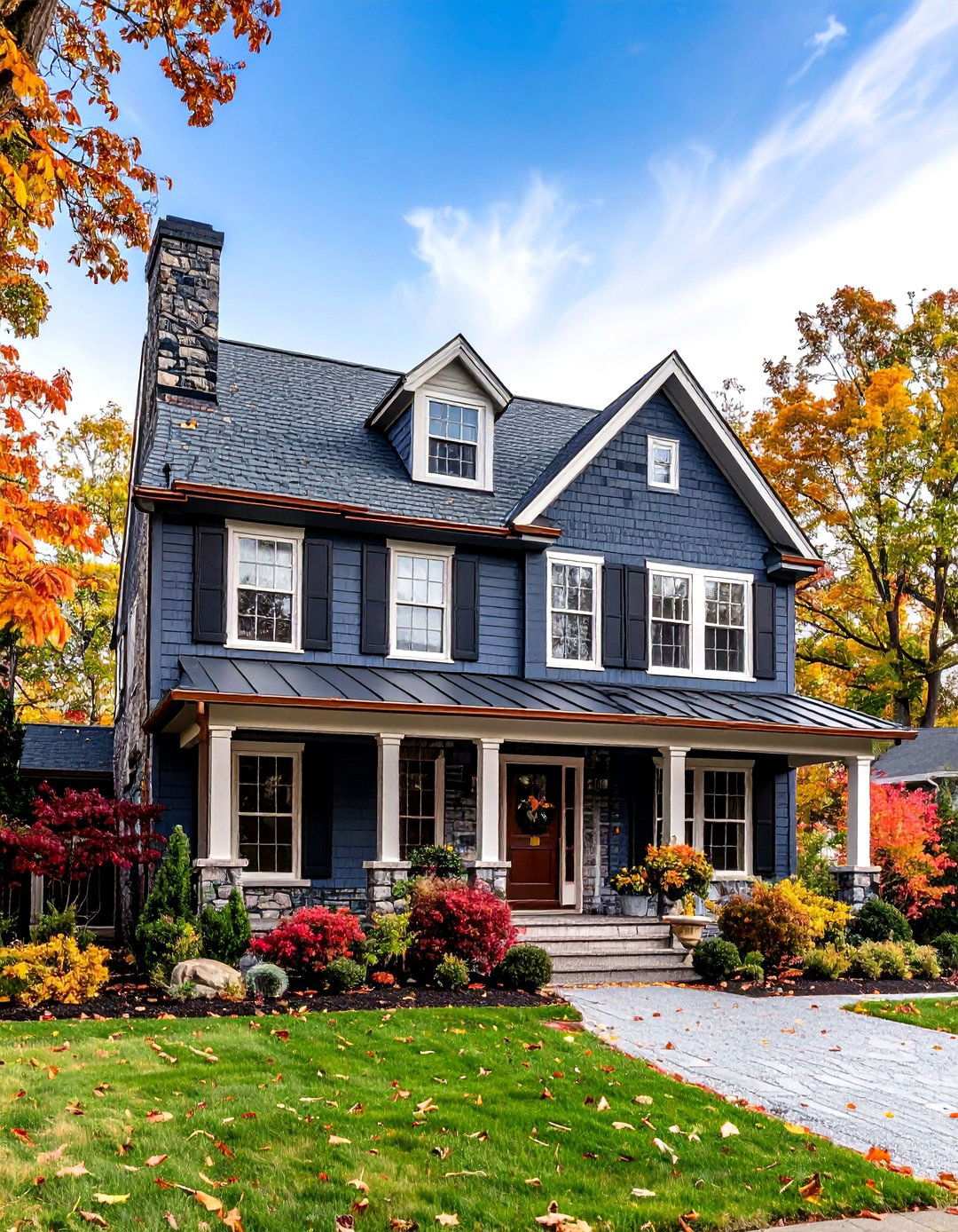
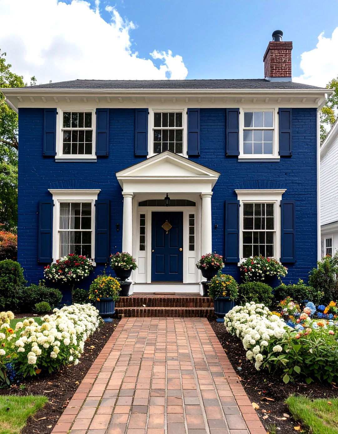
5. Daring Navy Blue Ranch Modern
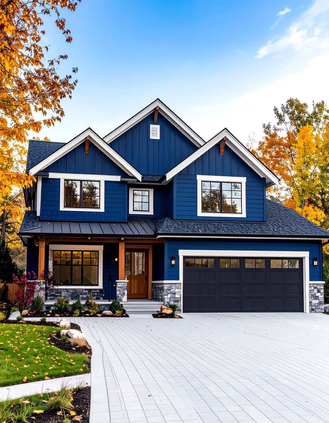
Bold, dynamic blues are on the rise in 2025, with navy blues offering a unique blend of warmth and depth that can elevate coastal, traditional, and modern homes. For a modern twist on the classic suburban ranch architecture, apply navy blue paint to brick homes, where it will add a pop of color and sophistication. The horizontal lines of ranch design become even more pronounced with the rich blue color, creating a visually striking effect that adds to the home’s curb appeal. Dark blue makes cedar wood and white accents stand out, transforming a forgettable exterior into the standout jewel of the neighborhood. Pair with crisp white trim and garage doors to maintain the clean, streamlined aesthetic that ranch homes are known for. Adding natural wood accents on doors or decorative elements brings warmth to the bold color choice, making your ranch home the envy of the neighborhood. By choosing a bold, navy blue exterior, you’re sure to make a lasting impression that will have your neighbors talking.
6. Whimsical Blush Cottage Charm
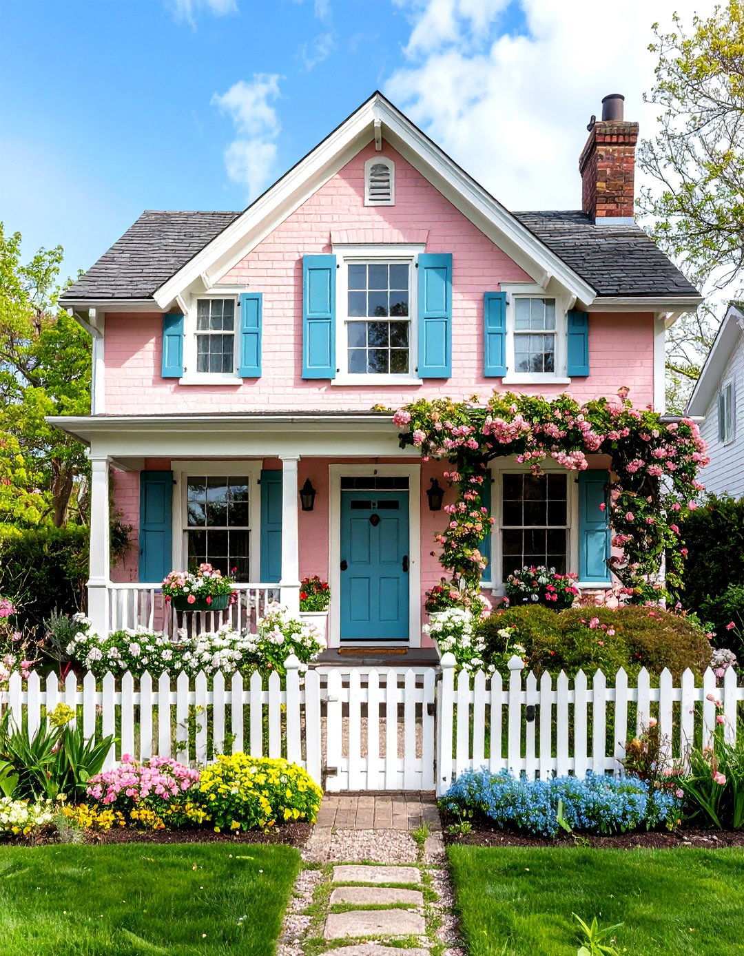
Blush pink hues bring undeniable charm to exterior design, as seen in charming colonial homes adorned with climbing ivy, sage green shutters, and elegant brick facades. Opt for soft dusty rose or blush tones on cottage-style brick homes to evoke a romantic, idyllic atmosphere reminiscent of storybook tales. This unexpected color choice harmonizes exquisitely with traditional cottage elements such as picket fences, lush flower gardens, and vines that gently cascade down the exterior walls. To balance the sweetness, pair the blush pink with deeper accent colors like sage green or navy blue on shutters and doors. The pink brick provides a beautiful backdrop for crisp white trim work, creating a warm, inviting aesthetic that never feels overwhelming. Blush pink bricks range from delicate, rosy tones to neutral shades with a subtle warmth, complementing soft colors and accents that share the same gentle radiance. By embracing this enchanting color choice, you’ll create a unique, captivating presence in your neighborhood that reflects your personality.
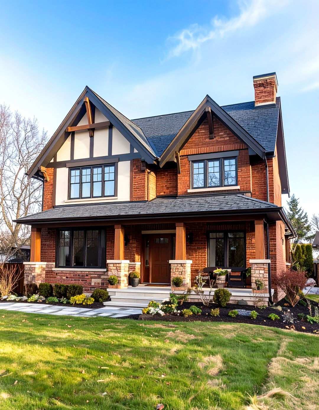
7. Dramatic Forest Green Victorian Elegance
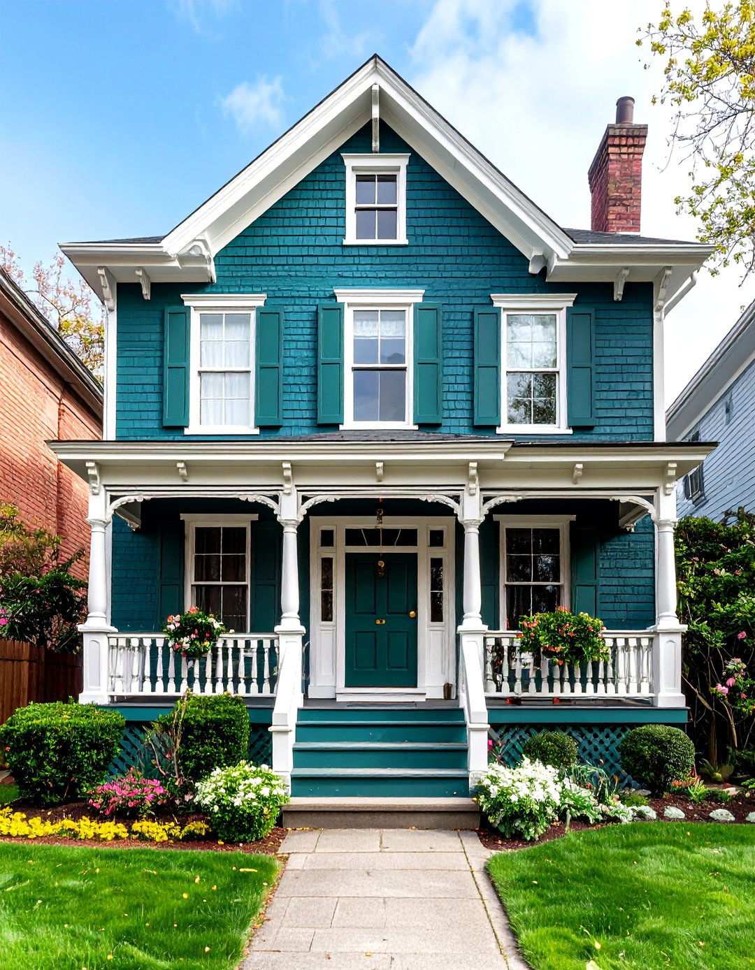
Nature-inspired hues have become increasingly popular, with muted sage, olive, and deep forest green colors ideal for homeowners seeking to harmonize their home’s exterior with the surrounding landscape. Apply rich, vibrant forest green to Victorian brick homes for a sophisticated color that accentuates intricate architectural details. The deep green creates striking contrast against crisp white gingerbread trim and decorative elements, while maintaining the period’s characteristic grandeur. Forest green paired with airy sage trim adds depth and dimension to the facade, offering a warm welcome to family and friends. This color choice works particularly well on homes surrounded by mature landscaping, as it effortlessly blends with natural surroundings. Gold or brass accents on hardware and lighting fixtures complete the elegant, refined Victorian aesthetic, exuding a sense of established luxury and timeless sophistication that never goes out of style.
8. Timeless Creamy Off-White Traditional Appeal
Soft, warm off-whites create the perfect balance between contrast and cohesion, avoiding the blend-together effect often associated with pure white combinations. Choose creamy off-white paint for traditional brick homes seeking a fresh, updated appearance that still honors classical elegance. This versatile color choice seamlessly adapts across multiple architectural styles, providing a neutral backdrop for seasonal decorations and landscaping changes. Shell White is an excellent warm white option that creates contrast with darker trim elements, while pairing black or dark bronze window frames and doors yields a crisp, sophisticated appearance. The creamy undertones prevent the stark, cold feeling that pure white can create, while maintaining the bright, fresh look homeowners desire. Moreover, light colors tend to last longer than darker hues, ensuring your paint job remains vibrant for years to come. By embracing this timeless choice, you’ll showcase your preference for enduring style over fleeting trends.
9. Elevating Earthy Neutrals in Mediterranean Style
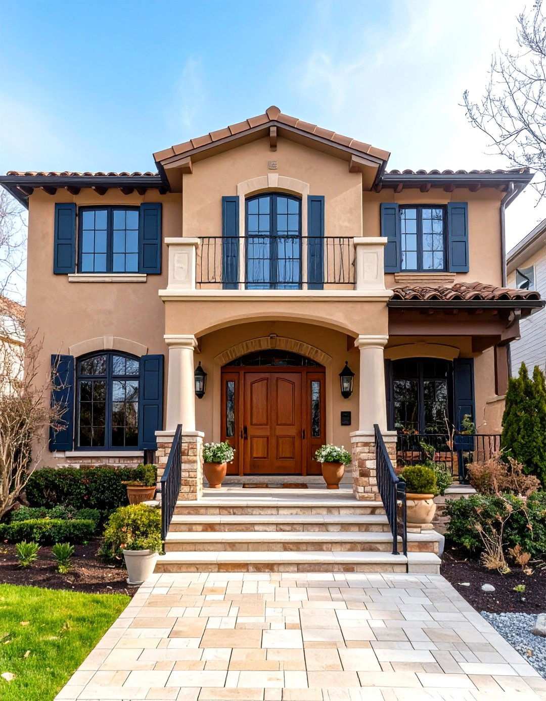
Earth-toned neutrals such as warm taupe and sandstone, characterized by their rich undertones, bring a sense of freshness to neutral color schemes. When applied to Mediterranean-style brick homes, warm taupe creates a sophisticated appearance that harmonizes beautifully with stucco elements, tile roofing, and other architectural features typical of the style. This versatile neutral bridges the gap between beige and gray, while maintaining warmth and depth. The taupe base seamlessly integrates with natural stone accents, wrought iron details, and terra cotta architectural elements, creating a cohesive look that defines Mediterranean design. Light bricks with a clean appearance offer a versatile canvas for various color schemes, allowing you to accentuate your home’s unique features. Deep brown or bronze trim colors enhance the warm undertones, creating a subtle yet striking contrast. Pair with lush landscaping featuring drought-tolerant plants and colorful tile accents to achieve an authentic Mediterranean courtyard feel.
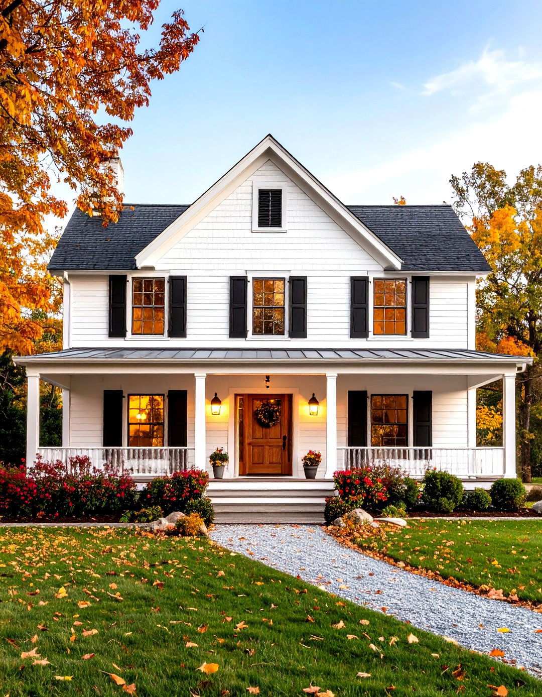
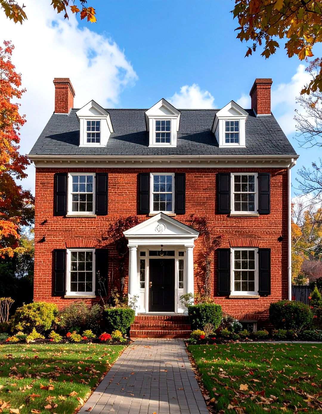
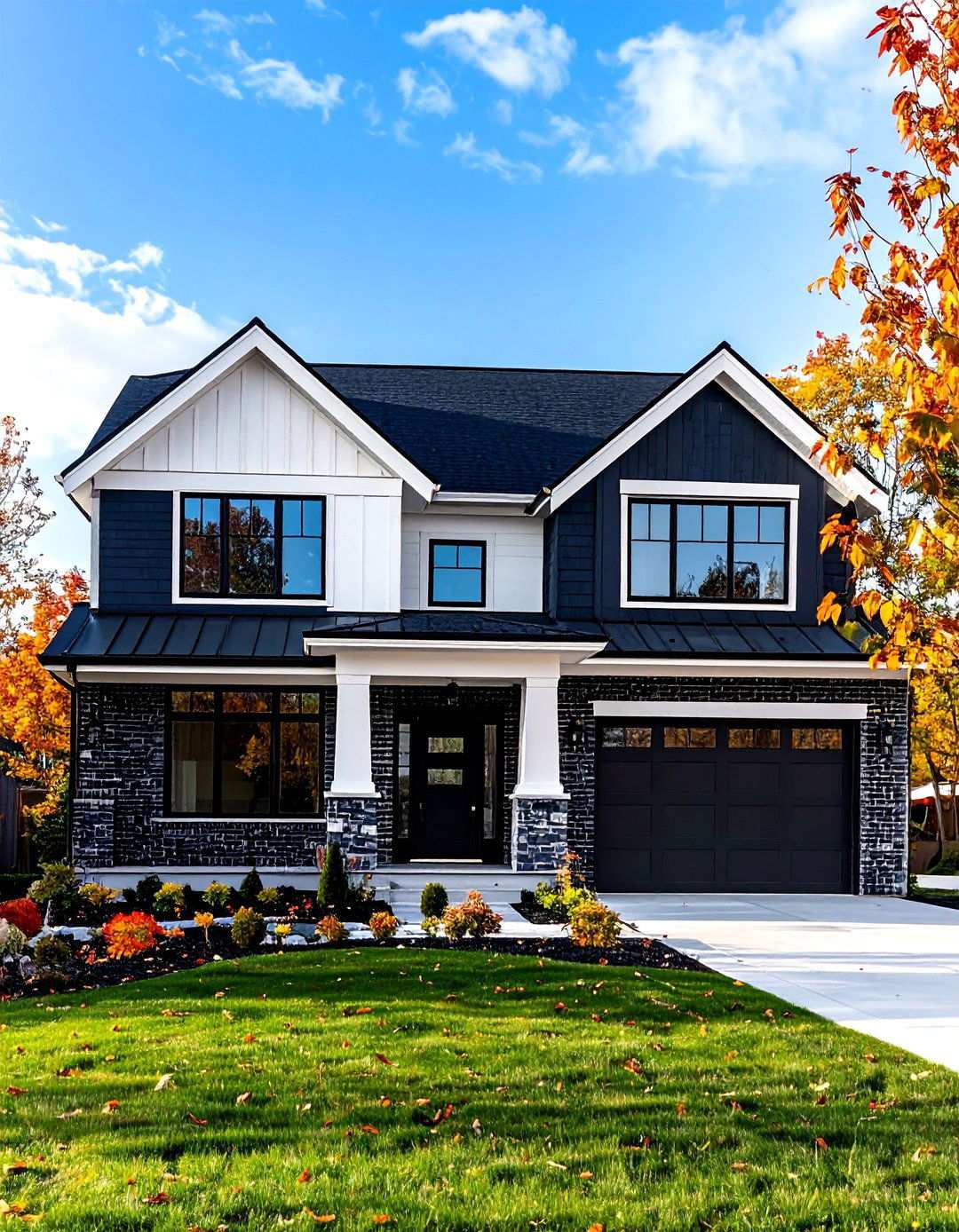
10. Unveiling Bold Black in Modern Farmhouse Style
Bold black is a striking exterior brick paint color that can instantly modernize older or traditional style homes, giving them a sleek and updated appearance. By applying sophisticated black paint to farmhouse brick architecture, you can create instant curb appeal and contemporary elegance. The dark color makes white trim, metal roofing, and natural wood accents appear more vibrant and striking, creating a visually appealing contrast. The timeless combination of black and white is one of the most popular color schemes on brick houses, looking beautiful on almost any style of exterior. To balance the dramatic color, incorporate warm lighting, natural materials, and plenty of greenery to prevent the space from feeling too stark. Keep in mind that dark colors absorb heat and may be more prone to moisture issues than lighter shades. When choosing a bold exterior color, consider how it positions your home as a design leader in your neighborhood.
11. Captivating Soft Blue in Coastal Colonial Style
The soft blue hue traditionally used on porches and front doors to ward off malicious spirits has become a classic appeal when used consistently throughout the exterior. Extend this coastal tradition by painting Colonial brick homes in soft blue tones that evoke a sense of seaside tranquility and timeless elegance. The gentle blue creates a sophisticated backdrop for white trim and natural wood elements, maintaining the Colonial style’s classical proportions. By carefully coordinating undertones, you can create a cohesive look that contrasts beautifully with the warm tones of the brick. Complement your soft blue exterior with white or cream shutters and warm brass hardware to achieve an authentic coastal aesthetic. This color choice works beautifully in both waterfront and inland settings, bringing a sense of calm and relaxation to busy family life. The soft blue provides perfect contrast for seasonal decorations and colorful flower gardens.
12. Elevating Elegance with Rich Burgundy
Rich burgundy painted brick can elevate the drama of Tudor-style homes, creating a sophisticated and opulent atmosphere that complements Gothic Revival elements and medieval-inspired architecture. This deep, rich color choice is perfectly suited to accentuate the period appeal of Tudor Revival homes, with bold contrasts between the warm red hue and white or slightly off-white body colors creating a stunning architectural statement. The deep red-wine color perfectly complements the characteristic steep rooflines, decorative half-timbering, and diamond-pane windows of Tudor homes, while cream or warm white trim highlights the home’s architectural details and maintains the style’s inherent richness. Additionally, Tudor homes often feature decorative half-timbering with stucco or stone filling, steeply pitched roofs with multiple gables, and ornate masonry details that benefit from a well-coordinated color scheme. A thoughtful combination of rich burgundy and complementary trim colors can enhance the sophisticated, Old-World atmosphere of a Tudor-style home, reflecting confidence in traditional craftsmanship and attention to architectural heritage.
13. A Touch of Sophistication with Light Gray
Light gray paint can add a classic, sophisticated touch to transitional brick homes, effortlessly bridging traditional and modern design elements. This versatile color choice provides enough contrast for white trim while remaining neutral enough to complement various accent colors and landscaping styles. Warm gray tones, such as Tyler Gray by Benjamin Moore, can create a sense of understated sophistication that stands the test of time. This adaptable color choice works beautifully with both warm and cool accent colors, allowing for flexibility in seasonal decorations and exterior styling changes. Furthermore, light gray makes both accent colors and landscaping pop against it, whether you choose contrasting front door colors like red or bold flowers, creating a dynamic and visually appealing exterior. By choosing light gray as your primary color, you can rest assured that your design preferences will remain timeless and stylish.
14. Warm Beige: A Fresh Approach to Neutral Color Schemes
Warm beige tones, reminiscent of sandstone and earthy undertones, represent a fresh and modern approach to neutral color schemes that emphasize texture and depth. These earthy shades are perfectly suited to Prairie-style brick homes, which often feature horizontal lines and natural materials characteristic of this architectural movement. The warm beige color enhances the design principles of Prairie-style architecture, which found inspiration in flat Midwest landscapes and emphasized abundant natural light, open floor plans, and connected indoor-outdoor spaces. To create visual interest, pair the warm beige with deeper brown tones for window trim and architectural details, subtly contrasting with the surrounding earthy color palette. This harmonious color scheme blends beautifully with native landscaping and sustainable design elements, allowing the home’s architectural features and natural surroundings to take center stage.
15. Blushing Beauty Revival
Romantic Revival and Queen Anne brick homes can be elevated by a delicate pink hue, which pairs exquisitely with accent colors that amplify their ornate architectural details. A dusty rose paint finish brings warmth and femininity to these classic structures, creating a charming and inviting atmosphere. This understated yet sophisticated color choice complements decorative trim work and period-specific features without overwhelming the facade. To prevent the tone from feeling overly sweet, pair the rose base with sage green or deep navy shutters and doors, creating a balanced contrast that showcases visual depth. Patterned elements and intriguing visual details add a sense of mystery while maintaining the home’s welcoming presence. A white or cream trim finish ensures architectural details remain prominent against the rose base, creating a unique and captivating presence.
16. Earthy Modern Heritage
Benjamin Moore’s Deep Creek medium brown shade has become a go-to option for those seeking a modern twist on traditional brick homes. This versatile color works seamlessly in shady locations and cooler climates, thanks to its light-absorbent properties. Designers often pair rich brown paint with off-white and black trim to create a striking contrast that elevates the home’s architectural style. The deep brown base enhances the characteristic steep rooflines and decorative elements of Tudor Revival homes, creating a warm and inviting appearance. Complementing the brown base with cream or warm white trim highlights the architectural details, while bronze or copper accents add a touch of sophistication and earthiness. This sophisticated color choice resonates with homeowners seeking warmth and a contemporary edge.
17. Nature's Harmony
Scandinavian design principles come to life when combining the calming properties of sage green with the sophistication of gray. This unique painted brick color creates a harmonious balance between nature and modernity, emphasizing texture and depth. On brick homes with clean lines and minimal ornamentation, the muted sage-green-gray tone provides a serene backdrop for white trim and natural wood accents. The understated color interest of this hybrid hue maintains the peaceful aesthetic of Scandinavian design while allowing architectural elements to take center stage. Pairing the color with white or light wood trim enhances the home’s geometric elements, creating a visually appealing contrast. Colors with gray undertones offer flexibility and appear to transcend fleeting trends. Natural materials like stone and wood complement this earthy color choice, creating a calming atmosphere that promotes wellbeing and connection to nature.
18. Timeless Cream and Navy Duo
A classic pairing of Benjamin Moore’s Newportbury Blue and Alabaster trim on Colonial or Georgian brick homes exudes sophisticated elegance, effortlessly blending tradition and modernity. The warm cream-colored brick base creates a cozy atmosphere, while navy blue trim adds a crisp, modern touch, setting the tone for a visually striking combination. This harmonious blend of contrasting colors is enhanced by the incorporation of wood accents throughout the design, adding depth and visual interest to the space. The striking contrast creates a sense of balance, which is essential for maintaining the formal elegance of these architectural styles. To complete the look, choose warm brass or bronze hardware to complement the cream base, while white window trim ensures that the architectural details remain prominent. This timeless combination works beautifully with both traditional and contemporary landscaping styles, making it adaptable to changing exterior preferences over time.
19. Whimsical Soft Yellow Haven
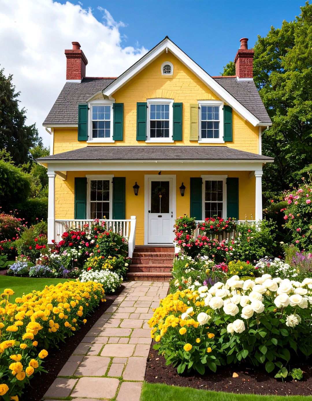
Cottage-style brick homes can be transformed into charming English countryside retreats with a gentle buttery yellow paint that radiates warmth and hospitality. The pairing of sunshine-yellow doors with off-white brick creates a warm, inviting appearance that exudes airy elegance with pure white window trim. Extending this cheerful approach to the entire brick facade creates a home that embodies the essence of garden-focused living. The soft yellow base provides a perfect canvas for white trim work, while creating an ideal backdrop for colorful flower gardens and climbing roses. Light brick colors with a clean appearance harmonize with many accent colors, making cottage garden styling particularly effective. Choose sage green or soft blue for shutters and doors to create a fresh, garden-inspired color palette that reflects a sense of joy and tranquility. This optimistic color choice creates a welcoming atmosphere that neighbors and visitors will cherish.
20. Bold Charcoal and White Contrast
In contemporary homes, inky black trim creates a striking contrast against a cool white brick exterior, framing floor-to-ceiling statement windows with a fresh, modern aesthetic. To achieve a similar effect, reverse this combination by painting the brick charcoal gray and using white for trim elements on modern minimalist homes. The dark exterior takes center stage, offering a refined and striking aesthetic that is particularly effective for contemporary or minimalist architecture where clean lines and sharp contrasts amplify design. The dramatic contrast highlights geometric elements and architectural details, while creating sophisticated curb appeal. Charcoal gray adds depth as an accent color, commanding attention for all the right reasons. Choose white or light gray for window frames, garage doors, and trim work to maintain the crisp, contemporary aesthetic. This bold combination works especially well on homes with large windows and simple, geometric shapes, creating a sense of modernity and sophistication.
21. Timeless Alabaster Elegance
Sherwin-Williams’ Alabaster paint color presents a stunning option for exterior brick homes, blending seamlessly into the Craftsman aesthetic. By applying this sophisticated white, homeowners can restore their properties to their former glory while paying homage to the Arts and Crafts movement’s core values. With a focus on simplicity and natural materials, Craftsman architecture often features exposed beams, rustic wood accents, and an organic connection to the outdoors. The warm, inviting tone of Alabaster creates a beautiful canvas for showcasing wood trim, stone accents, and metal details, giving the home a fresh, revitalized appearance. This classic color combination is particularly effective when paired with darker trim elements, such as rich brown or forest green, which evoke the movement’s deep connection to nature. By choosing a timeless color like Alabaster, homeowners can honor their architectural heritage while enhancing their property’s value and appeal.
22. Whimsical Lavender Charm
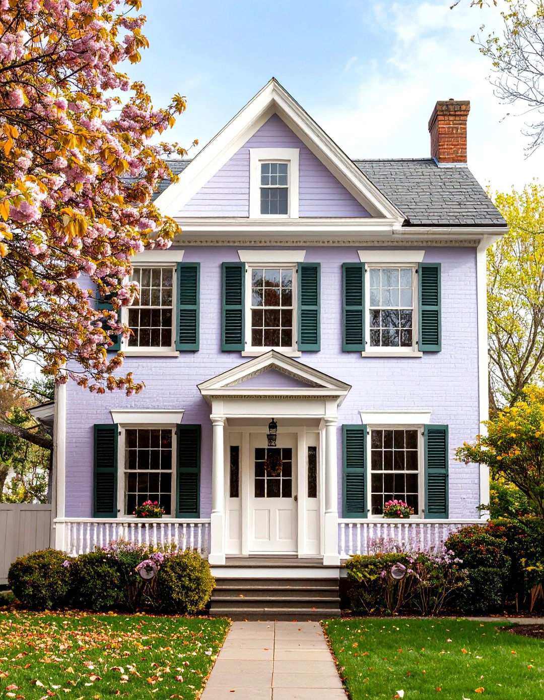
For a unique and captivating look, consider soft lavender as a painted brick color for Victorian homes. This elegant, yet understated, hue adds a touch of sophistication to elaborate architectural details, allowing individual style to shine. Soft, gentle colors like lavender work particularly well with ornate Victorian facades, as they create a beautiful contrast to the intricate trim work and decorative elements. Pairing lavender brick with crisp white or cream trim highlights the home’s gingerbread details, while sage green or soft gray shutters provide a balanced, harmonious contrast. As a backdrop for white picket fences, cottage gardens, and climbing flowering vines, lavender creates a charming and inviting atmosphere typical of Victorian residential settings. By choosing a bold, yet thoughtful, color like lavender, homeowners can express their confidence in personal style while respecting the period’s emphasis on decorative artistry and craftsmanship.
23. Desert Harmony with Terracotta Adobe
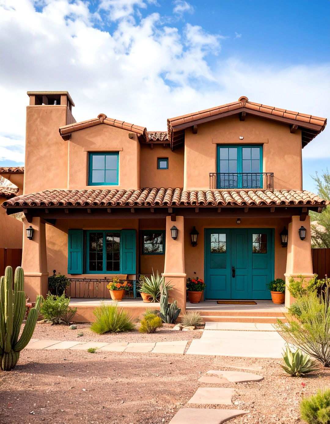
Pueblo Revival architecture’s distinct charm draws inspiration from Native American structures, employing a unique blend of materials such as mud, concrete, stucco, or mortar, and robust walls to shield against the unforgiving desert climate. Terracotta-hued brick homes in the Southwest region boast a timeless appeal by paying homage to traditional adobe construction while delivering modern durability. The warm, earthy tone of terracotta brick harmoniously blends with the desert landscape and natural stone accents characteristic of regional architecture. When paired with a variety of accent colors, from subtle black shutters to vibrant turquoise details, orange-toned brick exudes elegance and sophistication. Complementing the warm base with deep brown or bronze trim colors adds depth, while turquoise or sage green accents inject regional authenticity. This harmonious color scheme pairs beautifully with tile roofing, wrought iron details, and drought-tolerant landscaping featuring native plants and natural stone elements. By embracing regional building traditions, terracotta-hued brick homes achieve a perfect balance of classic style and contemporary appeal.
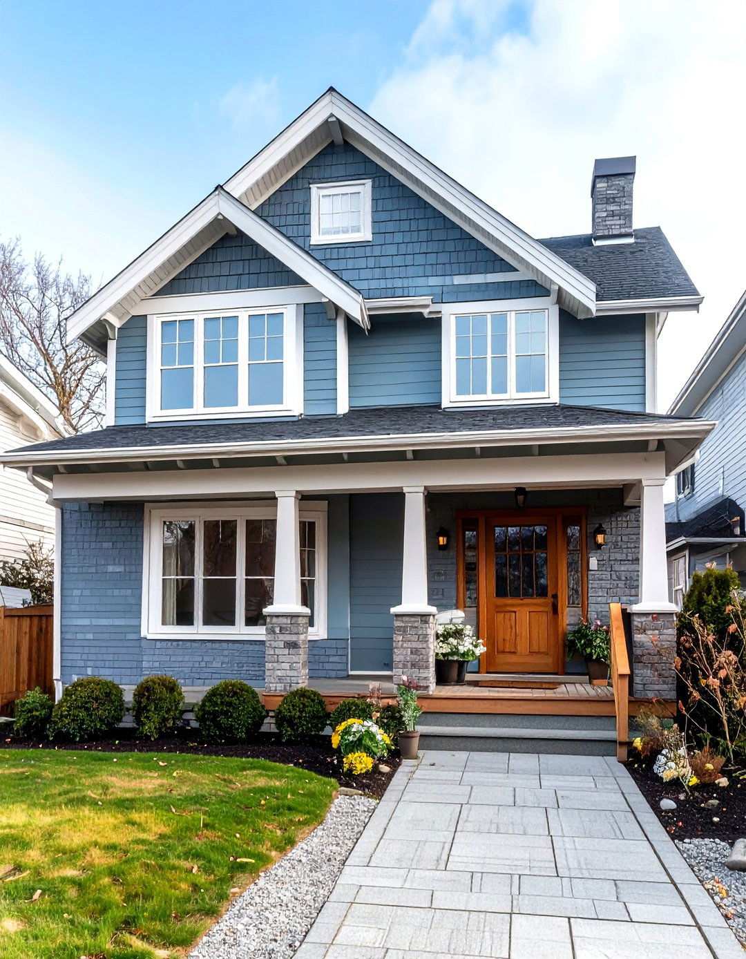
24. Coastal Elegance with Cool Blue Gray
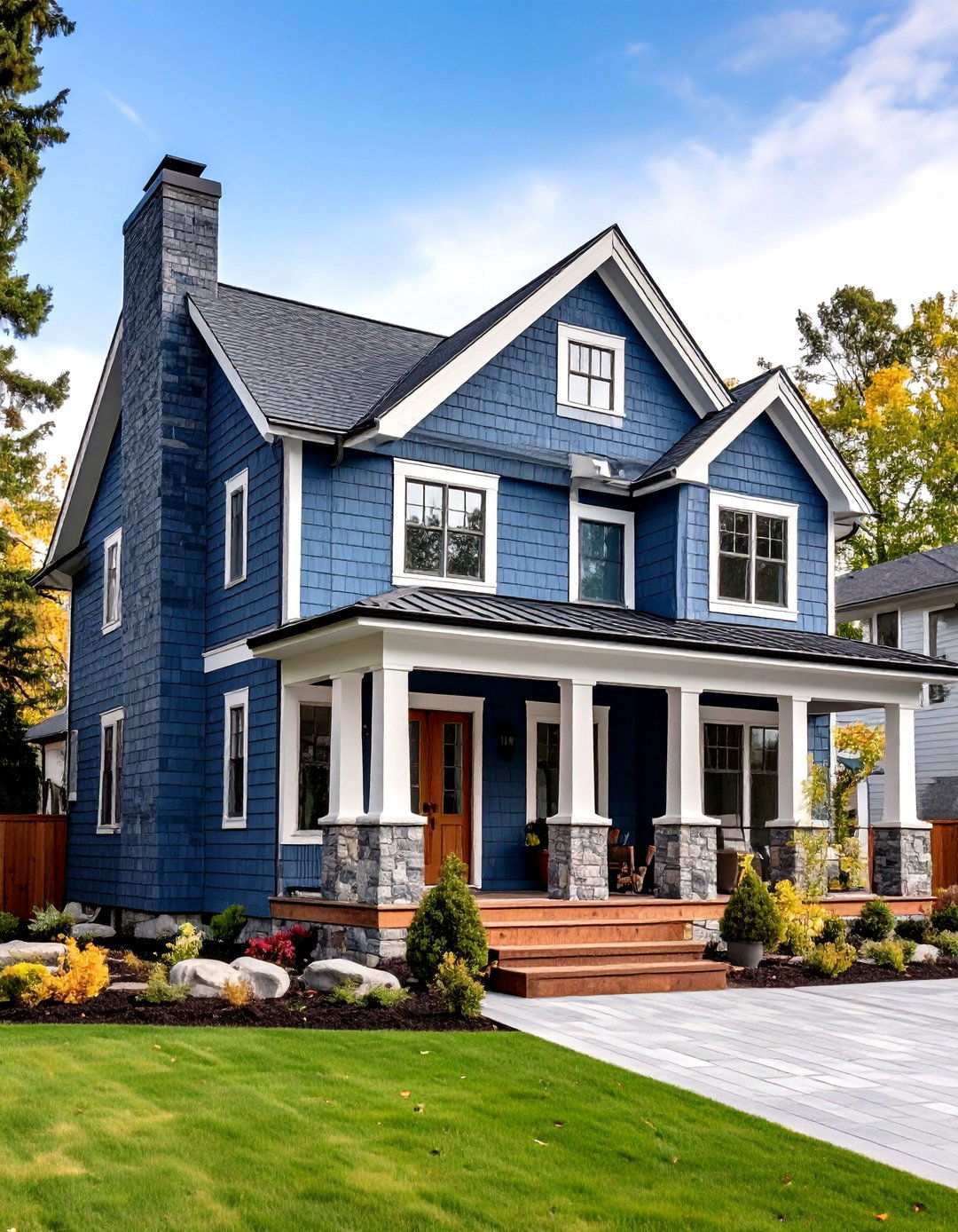
Gray-blue hues create a striking contrast when paired with cedar wood and white accents, transforming dull exteriors into showstopping neighborhood highlights. Apply a cool blue-gray paint to modern coastal brick homes for a sophisticated color that masterfully captures the essence of seaside influences and contemporary design principles. By matching blue paint to the existing siding, homeowners can create a cohesive look that makes their house appear larger while harmonizing with white trim and architectural details. The muted blue-gray provides an ideal backdrop for white trim work and natural wood accents, conjuring a calming, spa-like atmosphere that’s perfect for coastal living. Homeowners seeking to blend their home’s exterior with the surrounding landscape will appreciate nature-inspired colors that bring a sense of serenity to their property. For a cohesive look, pair warm white or cream trim elements with natural wood doors and shutters, which add warmth to the cool color palette. This sophisticated combination brings coastal tranquility to contemporary family living, making it perfect for both waterfront and inland settings.