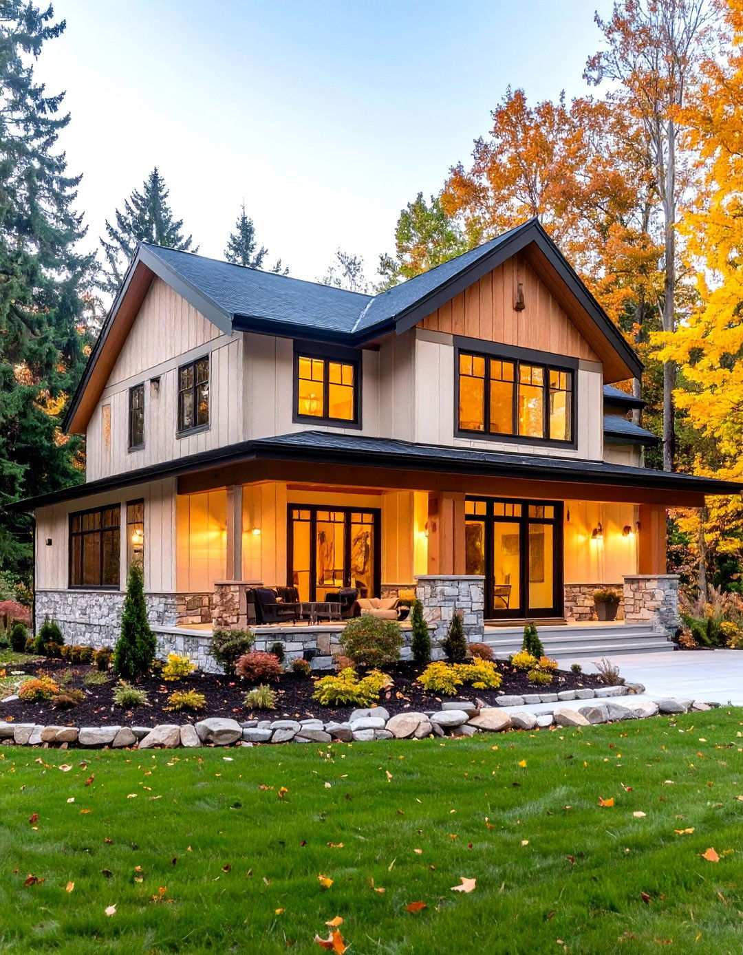
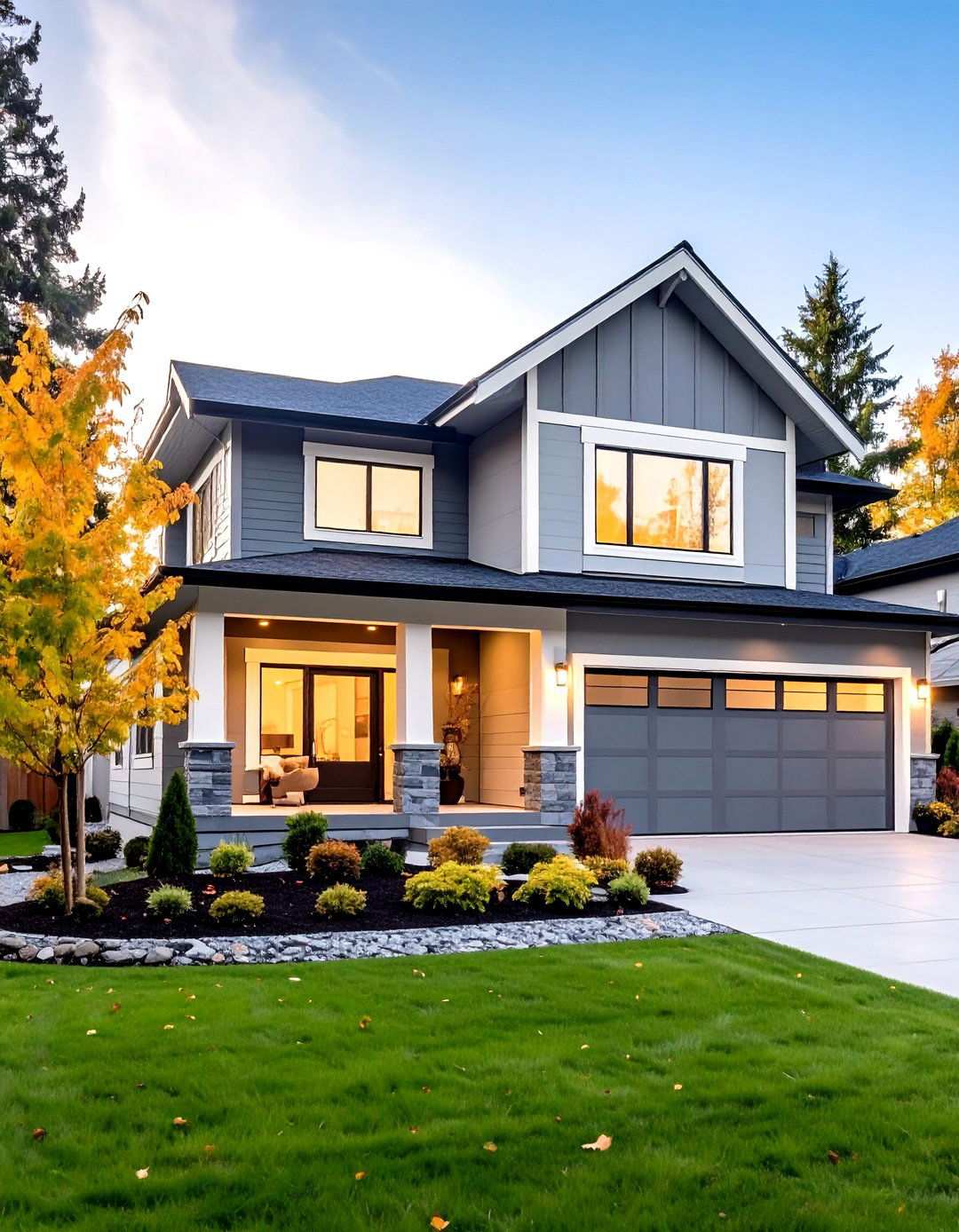
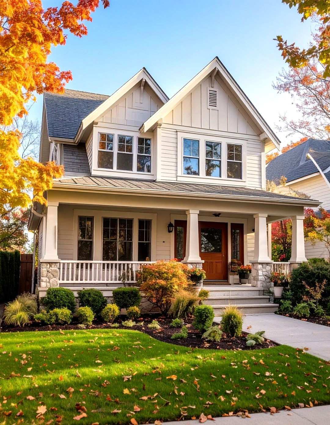
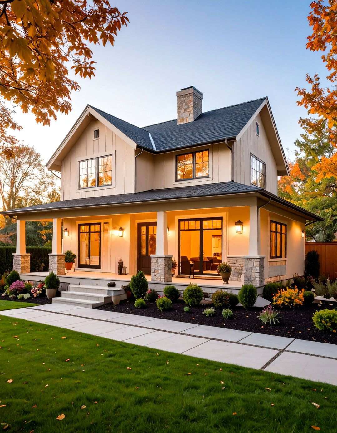
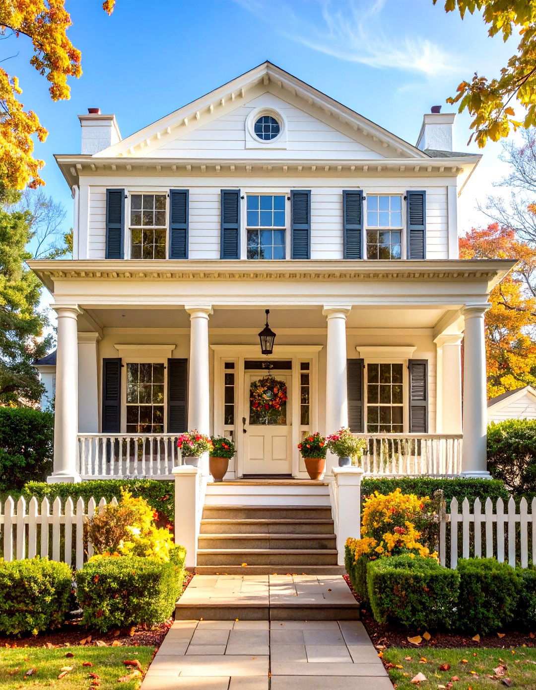
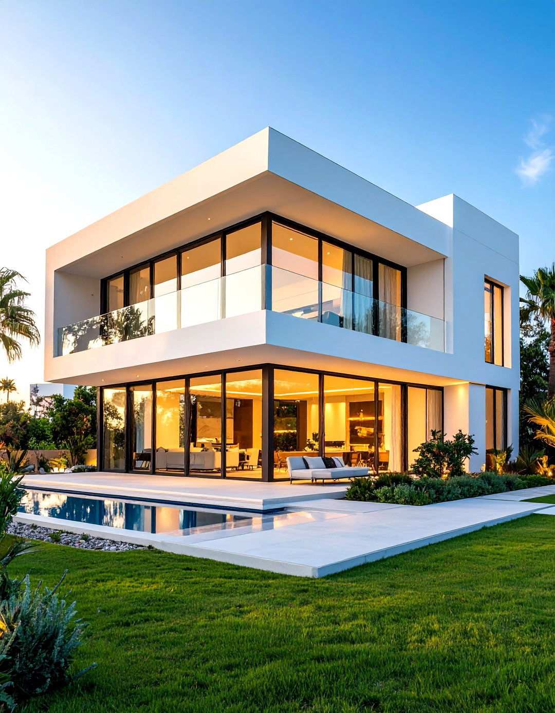
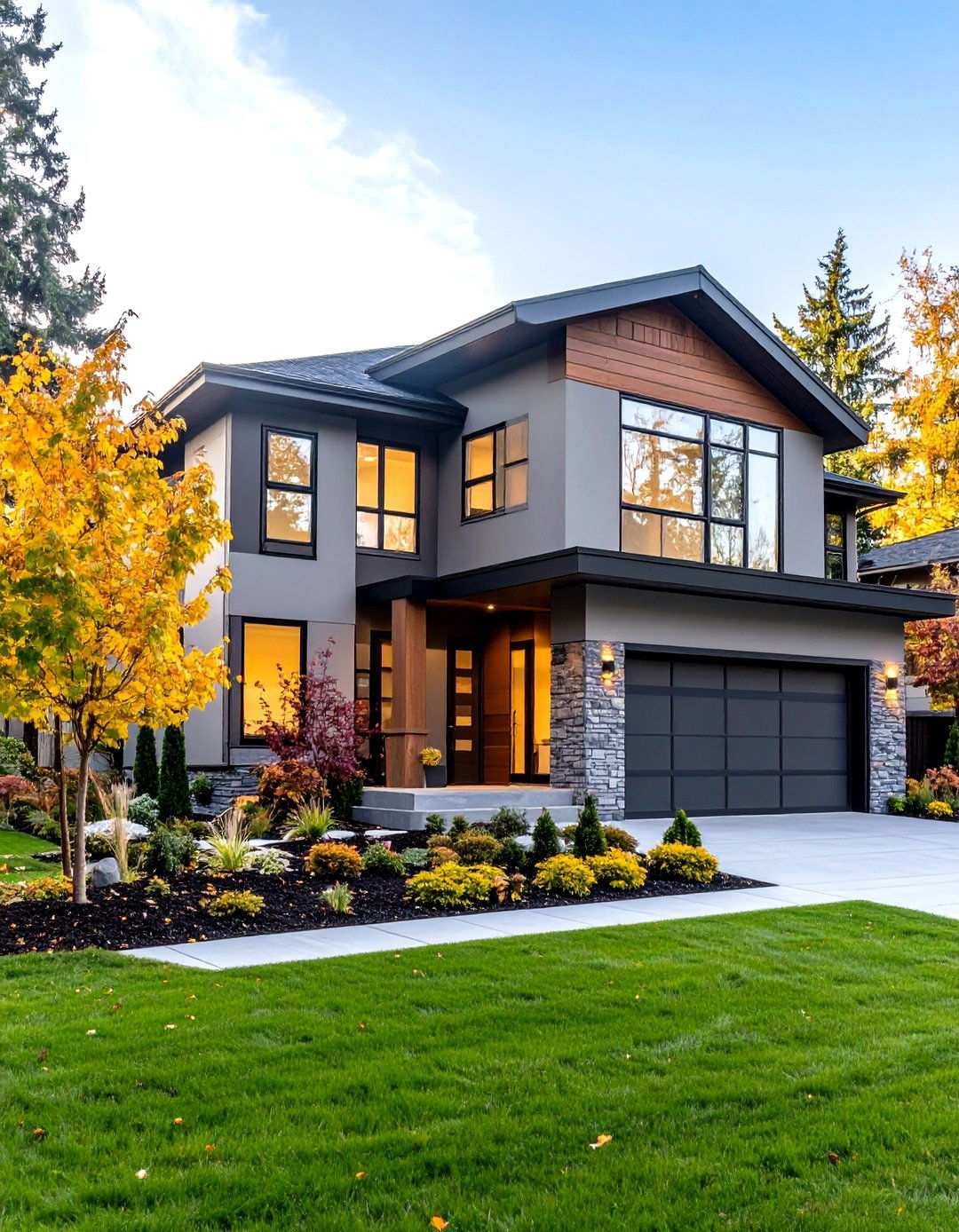
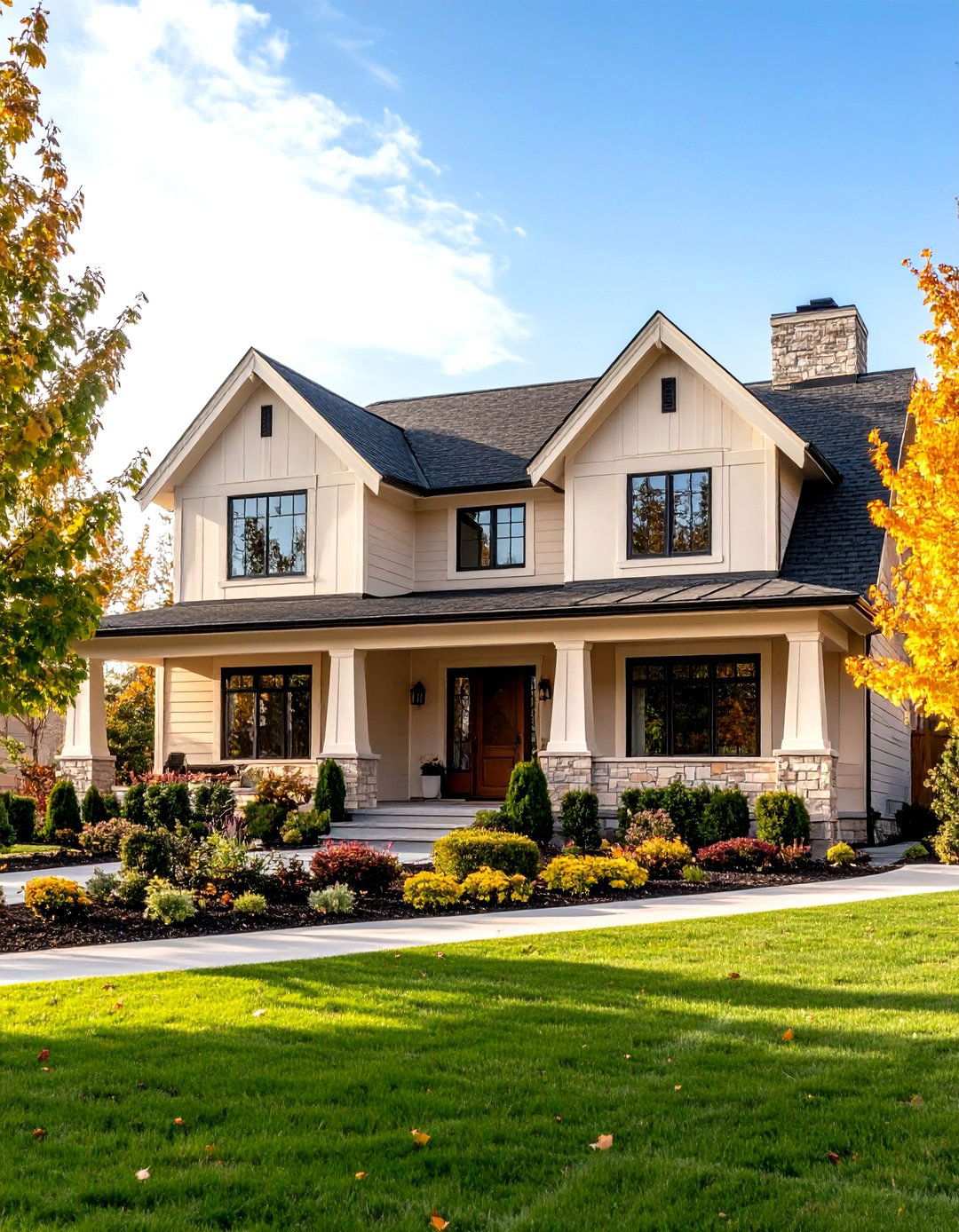
1. Effortless Elegance with Off-White Hues
Off-white paint colors can elevate your home’s exterior beyond mere aesthetics, fostering a sophisticated atmosphere and timeless appeal. By blending the brightness of white with undertones that add depth and warmth, these subtle shades create a clean yet inviting appearance. Unlike harsh white paints that can appear jarring in direct sunlight, off-white colors offer a softer approach to exterior design, perfect for homes of various architectural styles. Whether your taste leans towards warm, creamy tones or cooler grays with blue undertones, off-white exteriors deliver lasting elegance that boosts curb appeal and market value.

As an Amazon Associate I earn from qualifying purchases.
2. Timeless White Dove: A Classic Choice
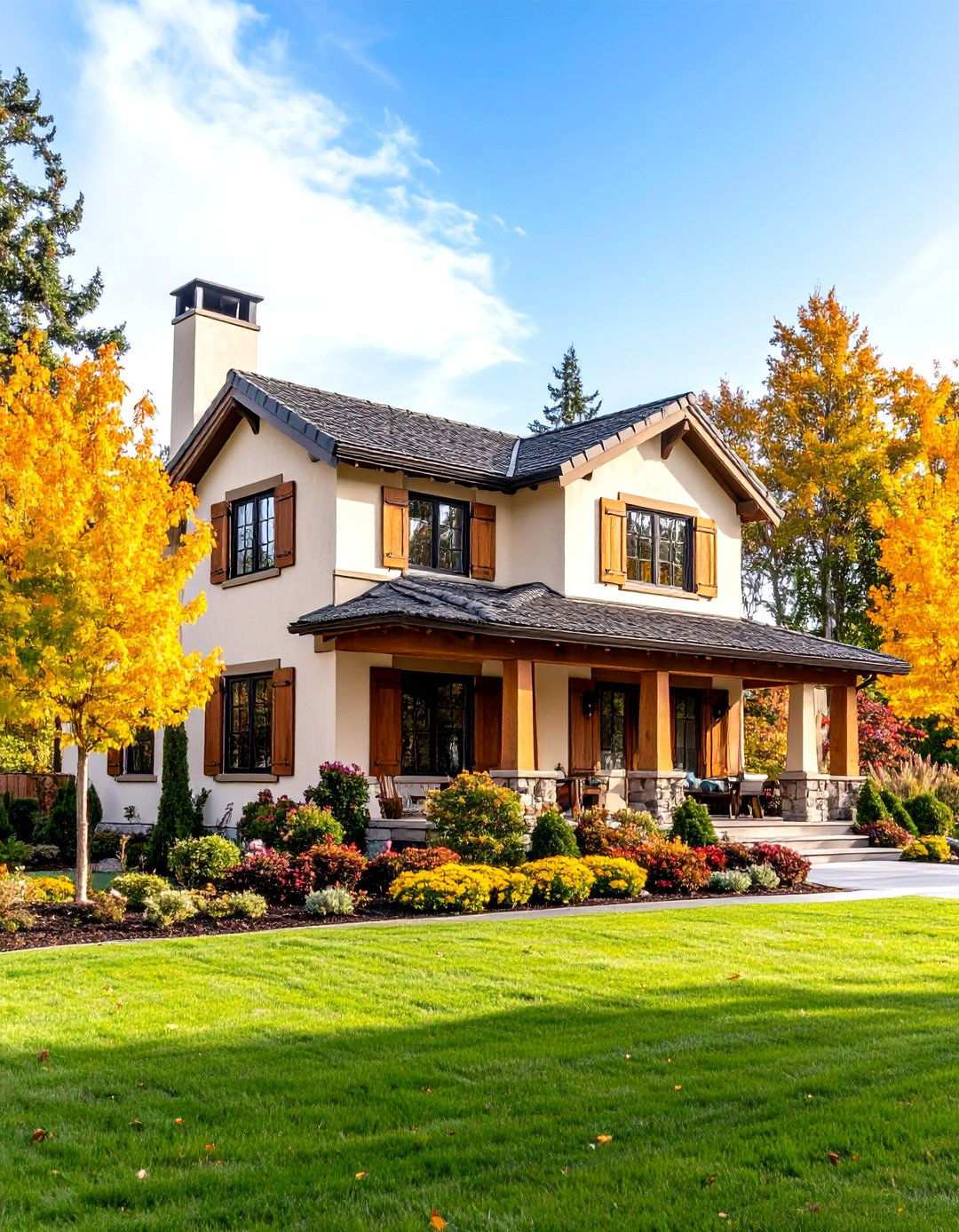
When it comes to timeless off-white exterior paint options, White Dove stands out as a clear favorite. This sophisticated color achieves a perfect balance between crisp brightness and subtle warmth, making it a versatile choice that never goes out of style. With gentle gray undertones, White Dove avoids appearing too stark while maintaining enough brightness to keep your home feeling fresh and inviting. The color adapts seamlessly to different lighting conditions, appearing warmer in morning light and cooler during overcast days. As a result, White Dove works exceptionally well with both traditional and contemporary architectural styles, making it an ideal choice for colonial, craftsman, or modern farmhouse exteriors. Its high light reflectance value ensures your home looks bright and welcoming, while the gray undertones provide just enough depth to create visual interest without overwhelming the design.
3. Modern Elegance with a Touch of Warmth
For homeowners seeking a modern exterior look that exudes sophistication, Simply White is an attractive choice. This off-white hue boasts a bright, clean appearance with gentle warm undertones that prevent harsh glare and create a welcoming atmosphere. Its timeless appeal has made it a popular option for those who want the benefits of white without the cold, sterile feeling associated with pure white paints. In natural sunlight, the color’s subtle yellow undertones come to the forefront, adding a sunny disposition to your home’s exterior. Simply White pairs particularly well with modern and transitional architectural styles, accentuating clean lines and minimal ornamentation. Its brightness draws attention to architectural details, while the warmth creates an inviting ambiance. When paired with a range of accent colors, from warm to cool, Simply White provides a versatile foundation for creative exterior design.
4. Timeless Traditional Appeal
China White’s unique blend of beige and taupe undertones sets it apart as a classic choice for traditional home exteriors. This warm off-white color delivers sophisticated charm with a welcoming, lived-in feel that complements traditional materials naturally. Unlike brighter whites, China White won’t appear stark against brick, stone, or wood elements, creating a harmonious balance that enhances your home’s curb appeal. In established neighborhoods with mature landscaping, the color’s lower light reflectance value provides a softer appearance that blends seamlessly with its surroundings. China White excels on colonial, craftsman, and cottage-style homes where a more muted white appearance adds character without overwhelming the architectural details. The color’s warm undertones create a cozy atmosphere while maintaining the clean, classic look that makes white exteriors so enduringly popular. When paired with darker trim colors and natural accent materials, China White creates a beautiful balance of sophistication and charm.
5. The Versatility of Pure Sophistication
What sets Chantilly Lace apart is its remarkable versatility as one of the purest off-white options for exteriors. This neutral white boasts minimal undertones, creating a fresh, cotton-like appearance that adapts to any architectural style or color scheme with ease. The color’s high light reflectance value ensures maximum brightness, while subtle neutral undertones prevent harsh glare, making it an excellent choice for homeowners who value consistency. Chantilly Lace performs exceptionally well in various lighting conditions, maintaining its crisp, clean appearance from morning through evening. Its reliability makes it perfect for those who want a white exterior that looks consistently beautiful regardless of weather or seasonal changes. When paired with bold accent colors or neutral trim and natural materials, Chantilly Lace serves as an excellent foundation for a sophisticated and timeless look.
6. Pale Oak Greige Beauty
Homeowners seeking to strike a balance between white and greige exteriors may find Pale Oak to be the perfect compromise. This refined color masterfully merges the airy brightness of white and the warm undertones of greige, creating a visually appealing and inviting exterior. As sunlight hits the color, its subtle yellow undertones become more pronounced, while the gray base prevents the color from veering into the realm of yellow or cream. Pale Oak seamlessly integrates with a wide range of home styles, particularly those that incorporate natural materials or feature stunning landscape views. Its versatility also makes it an excellent choice for open floor plans, where the color effortlessly flows from interior to exterior spaces. Furthermore, Pale Oak’s neutral foundation pairs effortlessly with both warm and cool accent colors, making it an ideal choice for homeowners who crave flexibility in their exterior design while maintaining a sophisticated look.
7. Edgecomb Gray Versatile Neutral
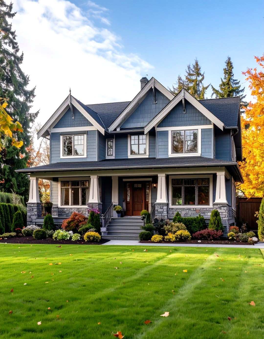
Designers frequently opt for Edgecomb Gray for its exceptional versatility in exterior color schemes. This beautiful greige strikes a perfect balance between gray and beige, resulting in a sophisticated neutral that adapts seamlessly to diverse lighting conditions and architectural styles. The color’s unique green undertones inject warmth without succumbing to the yellow tones that often plague similar shades. Meanwhile, the gray base ensures Edgecomb Gray never appears too beige or outdated, making it a timeless choice for traditional home styles. The color’s moderate light reflectance value provides superior coverage while its complex undertones add visual interest, making it an excellent choice for homeowners who desire a neutral exterior without sacrificing aesthetic appeal. Additionally, Edgecomb Gray pairs beautifully with both warm and cool trim colors, offering unparalleled flexibility in design choices.
8. Revere Pewter Timeless Appeal
Revere Pewter has earned its place as a beloved choice for exterior applications across various home styles, and its enduring popularity is well-deserved. This soft, inviting greige boasts remarkable versatility, effortlessly adapting to different lighting conditions and surrounding elements to appear warm or cool as needed. The color’s subtle green undertones add depth and sophistication while maintaining its neutral appeal, making it suitable for any architectural style. Revere Pewter works particularly well on traditional and transitional homes where a sophisticated neutral accentuates rather than competes with architectural details. Its adaptability is a key factor in its widespread appeal, as it seamlessly coordinates with natural materials and provides an excellent foundation for both bold and subtle accent colors. As a result, Revere Pewter is perfect for homeowners who value flexibility and timeless appeal in their exterior design.
9. Elegance in Balance: Balboa Mist's Light, Airy Effect
Balboa Mist’s sophisticated appearance on home exteriors can be attributed to its masterful blend of gray and subtle red-violet undertones. This nuanced balance brings warmth without overpowering the overall neutral ambiance, resulting in a color that effortlessly elevates the visual appeal of any property. Its higher light reflectance value imbues the color with brightness, while the intricate undertones add a captivating depth that pure whites often lack. As a result, Balboa Mist shines in various lighting conditions, exuding a soft, refined character in morning light that persists throughout the day. This versatility makes it an exceptional choice for homes situated in diverse climates and orientations, as well as those featuring traditional or contemporary architectural styles.
10. Classic Gray: A Sophisticated Canvas for Exterior Design
Homeowners seeking the refined simplicity of Classic Gray often appreciate its understated color without the long-term commitment of darker neutrals. The color’s subtle undertones create a sophisticated backdrop that amplifies architectural details while maintaining a sleek, contemporary appearance. Classic Gray’s high light reflectance value contributes to a sense of brightness and airiness, while the delicate gray undertones prevent the stark appearance often associated with pure white. This harmony of light and subtle color makes Classic Gray an ideal choice for modern and minimalist architectural styles, where clean lines and refined sophistication are essential design elements. Furthermore, its flexibility allows for a wide range of accent colors and natural materials, making it an excellent option for those who prefer understated elegance over bold color statements.
11. Natural Cream: A Welcoming Hue with Endless Versatility
The distinctive ability of Natural Cream to create inviting exterior appearances can be attributed to its perfect balance of cream and gray tones. This nuanced blend brings warmth without overwhelming the overall neutral character, making it suitable for a wide range of architectural styles. The color’s subtle undertones create a sense of depth and visual interest while maintaining the fresh, clean appearance that light neutrals are known for in exterior applications. Natural Cream’s moderate light reflectance value ensures excellent coverage without sacrificing its character, even in bright sunlight conditions. As a result, it works particularly well with both warm and cool color schemes, providing homeowners with the flexibility to create a unique and inviting exterior design that complements their personal style.
Gentle Cream Understated Sophistication
Gentle Cream is a masterclass in balance, seamlessly blending warm, beige-orange undertones with neutral sophistication to create a look that’s both inviting and elegant. This understated color exudes a sense of refinement that’s perfect for discerning homeowners seeking a subtle warmth that complements their home’s architectural character without overpowering it. Unlike more vibrant cream shades, Gentle Cream offers a gentle warmth that enhances the overall neutral character of a space, making it an excellent choice for traditional and transitional home styles. Its ability to perform beautifully in various lighting conditions – from soft and welcoming in natural light to elegant and sophisticated in different seasons – only adds to its appeal.
Alabaster Warm White Elegance
Alabaster has long been a favorite among homeowners seeking a sophisticated exterior color scheme that exudes warmth and elegance. This creamy white shade boasts a perfect blend of brightness and subtle yellow-beige undertones, creating a look that’s both timeless and inviting. The color’s excellent coverage and versatility make it suitable for a wide range of architectural styles, from traditional colonial homes to modern farmhouse designs. Whether it’s morning light or the golden glow of sunset, Alabaster maintains its beautiful character, appearing warm and inviting while retaining its sophisticated appeal throughout the day. Its ability to pair beautifully with both natural materials and bold accent colors only adds to its appeal, making it an excellent foundation for creative exterior design schemes.
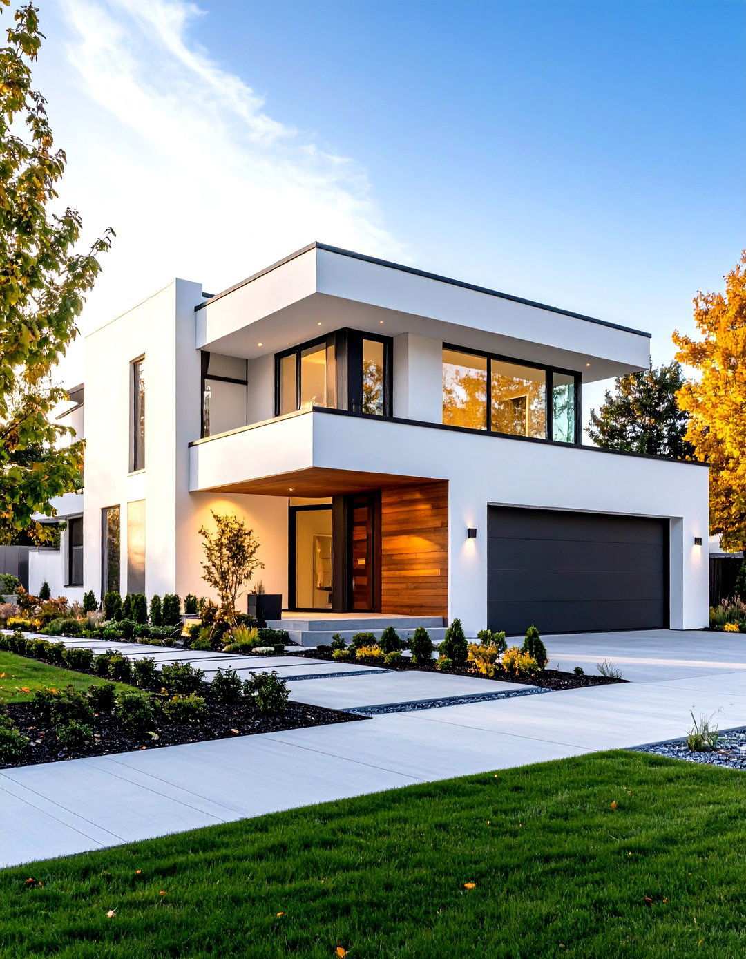
Pure White Contemporary Sophistication
For homeowners seeking a clean, contemporary exterior look that exudes maximum brightness and sophistication, Pure White is an excellent choice. This refined white shade features subtle warm undertones that prevent the harsh, sterile appearance of true pure whites while maintaining a crisp, fresh appearance. The color’s excellent light reflectance ensures your home appears bright and inviting, while the gentle undertones provide just enough warmth to create a welcoming curb appeal. Pure White excels on modern and contemporary architectural styles where clean lines and minimal ornamentation benefit from a bright, sophisticated color choice. Its versatility extends to both warm and cool accent colors, making it perfect for homeowners who want a neutral foundation that won’t limit their design creativity while ensuring their home maintains a fresh, updated appearance.
15. Elevating Exterior Design with Snowbound's Timeless Charm
Snowbound’s enduring popularity as a top choice for vibrant exterior color schemes can be attributed to its unique blend of brightness and subtle neutral undertones. This crisp white hue achieves an exceptional level of radiance without succumbing to harsh glare, thanks to its expertly balanced gray undertones. As a result, Snowbound remains a consistently beautiful choice, unaffected by seasonal changes in weather. Its versatility makes it an ideal fit for both traditional and modern architectural styles, where clean, sophisticated color enhances rather than overwhelming the design. The color’s neutral undertones provide unparalleled flexibility for trim colors and accent materials, making Snowbound an excellent choice for homeowners seeking a reliable, high-performance white that offers endless design possibilities.
16. The Art of Soft Neutrality: Shoji White's Unique Appeal
Shoji White’s exceptional ability to create inviting exterior appearances stems from its distinctive blend of subtle beige and gray undertones. This creamy off-white hue provides warmth and depth, all while maintaining the sophisticated look that makes neutral exteriors so timeless. The color’s remarkable versatility makes it a perfect fit for various architectural styles, particularly those featuring natural materials that complement its soft, organic character. Shoji White performs beautifully in a range of lighting conditions, appearing warm and welcoming in natural sunlight while retaining its sophisticated character during overcast conditions. Its unique balance of warmth and neutrality has earned it a loyal following among homeowners seeking a color that provides the perfect blend of inviting warmth and design flexibility.
17. White Duck: The Masterful Blend of Cream and Sophistication
White Duck’s ability to seamlessly bridge the gap between cream and sophisticated gray is a true masterpiece. This warm off-white hue combines the best characteristics of both color families, offering creamy warmth with subtle gray undertones that create depth and visual interest. In natural lighting, the color’s complex undertones come alive, producing a rich, sophisticated appearance that enhances any architectural style. White Duck excels on traditional and transitional home exteriors, where subtle color adds character without overwhelming the overall design. Its moderate light reflectance value ensures excellent coverage, while the warm undertones prevent the color from appearing cold or sterile, making it the perfect choice for homeowners seeking sophisticated neutrals that feel welcoming and livable.
18. Sophisticated Balance for Endless Possibilities
Homeowners seeking the ultimate versatile neutral that effortlessly complements any design scheme should look no further than Agreeable Gray. This exceptional color boasts a perfect equilibrium of warm and cool undertones that seamlessly adapt to diverse lighting conditions and architectural styles. By avoiding the pitfalls of beige-like appearance while retaining sufficient gray character, Agreeable Gray strikes a sophisticated balance that feels both contemporary and fresh. Its unparalleled flexibility allows it to harmonize beautifully with traditional and modern design elements, creating an ideal foundation for bold or subtle accent colors. Moreover, this stunning greige performs consistently well in varying exposures and weather conditions, making it an excellent choice for homeowners who desire a reliable neutral that exudes beauty year-round while offering endless options for exterior design creativity.
19. Elegant Warmth for Inviting Exterior Schemes
Accessible Beige is a masterful choice for warm, inviting exterior color schemes due to its ability to strike the perfect balance between warmth and sophistication. This refined neutral leans slightly toward beige, imbuing its subtle taupe undertones with a gentle warmth that is both soothing and inviting. What’s more, Accessible Beige maintains its contemporary appeal, making it an excellent fit for traditional and transitional homes where warm neutrals enhance rather than compete with architectural character. The color’s exceptional coverage and beautiful character in various lighting conditions ensure it appears warm and sophisticated in natural sunlight while retaining its elegant appeal during overcast weather. This versatility makes Accessible Beige perfect for homeowners who want a neutral exterior that feels cozy and welcoming while remaining sophisticated enough for any neighborhood setting.
20. Timeless Balance of Warmth and Brightness
Creamy achieves its perfect balance between brightness and subtle warmth through a masterful blend of gentle yellow undertones and high light reflectance value. This popular off-white color provides warmth without overwhelming its clean, fresh appearance, making it an excellent choice for home exteriors. The subtle undertones add depth and character to Creamy, preventing it from appearing like a pure white. What’s more, Creamy works exceptionally well on various architectural styles, particularly those with natural materials or traditional design elements that complement its warm, organic character. The color maintains its beautiful appearance in different weather conditions, offering excellent flexibility for accent colors and trim options, making it perfect for homeowners who want reliable beauty with timeless appeal.
21. Elevating Exterior Design with Aesthetic White
Aesthetic White has emerged as a standout choice for contemporary exterior design, thanks to its unique blend of subtle warmth and sophisticated appearance. This soft, light beige color boasts muted undertones that add a touch of character without overwhelming the overall neutral appeal, making it an ideal choice for exterior applications. Unlike more yellow-based beiges, Aesthetic White strikes a delicate balance between gentle character and versatile neutrality, allowing it to seamlessly integrate with various design schemes. Its ability to harmonize with both warm and cool accent colors makes it a perfect fit for homeowners seeking flexibility in their exterior design choices. Moreover, Aesthetic White’s moderate undertones ensure that the color never appears flat or lifeless, while its subtlety provides an excellent foundation for creative design elements and natural materials.
22. Unlocking Sophistication with Oyster White
For homeowners seeking a white with character and depth, Oyster White presents a compelling solution. This warm white color boasts beautiful complexity through its subtle greige undertones, which dynamically shift in appearance based on lighting conditions and surrounding elements. The result is a visually engaging exterior color scheme that never appears flat or one-dimensional. Oyster White works particularly well on traditional and transitional architectural styles, where sophisticated color enhances rather than competes with design details. Its versatility makes it an excellent choice for various trim colors and natural materials, while its complex character ensures that your home’s exterior maintains visual interest throughout different seasons and lighting conditions.
23. Mastering Refined Elegance with Pearly White
Pearly White has proven to be a masterclass in refined, sophisticated appearances on home exteriors. This off-white color delivers perfect balance between brightness and subtle depth through its complex undertones, which provide character without overwhelming the overall neutral appeal. The color offers excellent coverage and retains its beautiful character in various lighting conditions, appearing crisp and elegant in morning light while maintaining its sophisticated appeal throughout the day. Pearly White works exceptionally well on both traditional and contemporary architectural styles, particularly those featuring clean lines or natural materials that complement its refined character. The color provides excellent flexibility for accent colors and design elements, ensuring that your home maintains a polished, sophisticated appearance that enhances curb appeal and neighborhood harmony.
24. Achieving Equilibrium with Amazing Gray
The appeal of Amazing Gray lies in its unique ability to strike a perfect balance between the sleek lines of contemporary design and the inviting warmth of a welcoming home. This light-hued color boasts a subtle blend of warm green-gray undertones, allowing it to seamlessly integrate into various architectural styles and personal design preferences. Amazing Gray’s versatility makes it an excellent choice for homeowners seeking a harmonious fusion of modern sophistication and timeless elegance. Whether paired with bold accent colors or subtle nuances, this color’s adaptability ensures a consistent and beautiful appearance across different exposures and weather conditions. Ultimately, Amazing Gray’s enduring popularity stems from its rare ability to evoke a sense of both contemporary freshness and timeless relevance, making it a perfect choice for homeowners who value a exterior color that remains visually stunning for years to come.